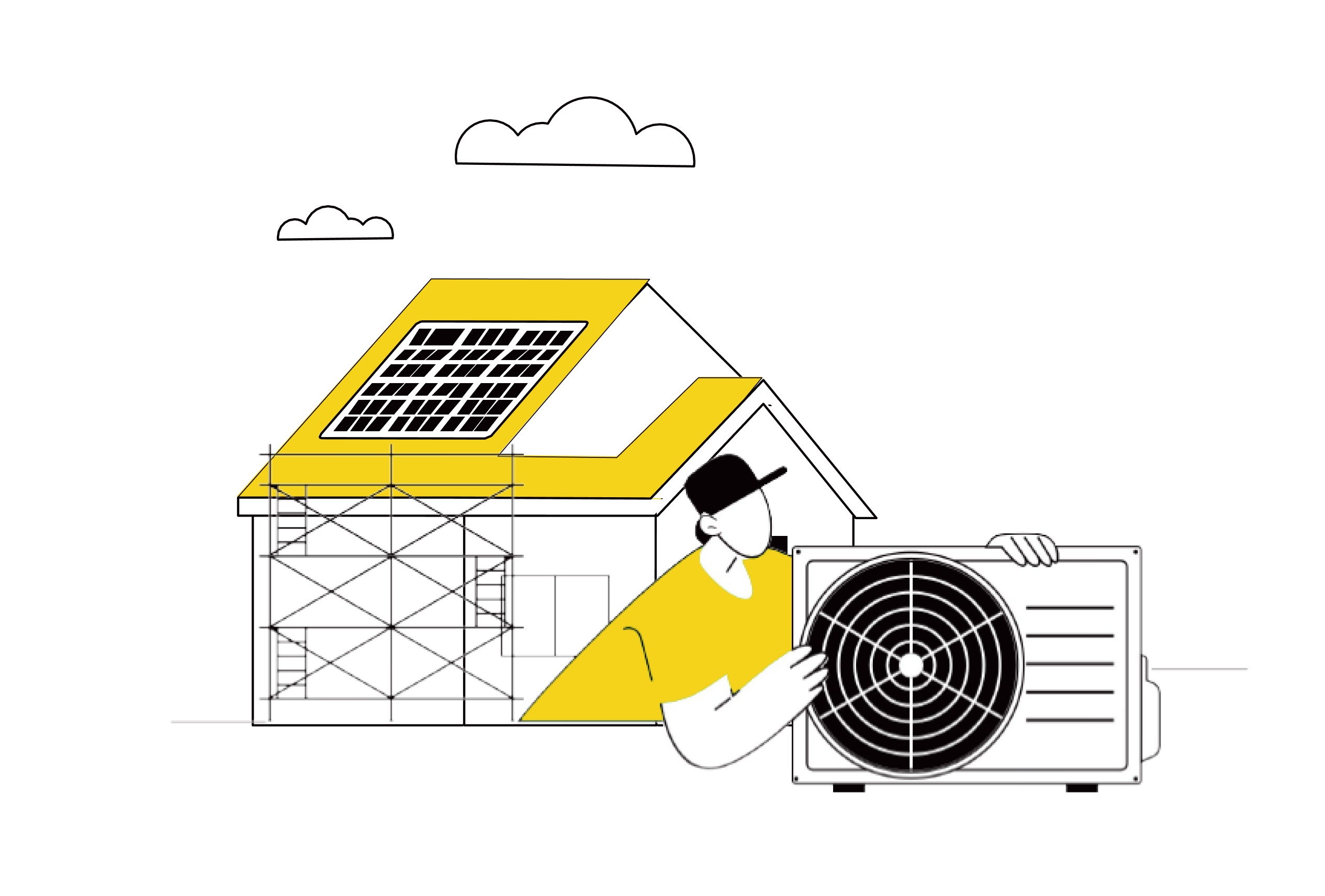
Energy transition: The 10 drivers for taking action

Thermal comfort: A sensitive driver amplified by seasonality
- 29% of Europeans experience an unpleasant or very unpleasant season. (Fig.21)
- 21% of Europeans experience an unpleasant or very unpleasant winter season. (Fig.22)
Fig 21 – Comfort of the home according to seasons
Download this infographic for your presentations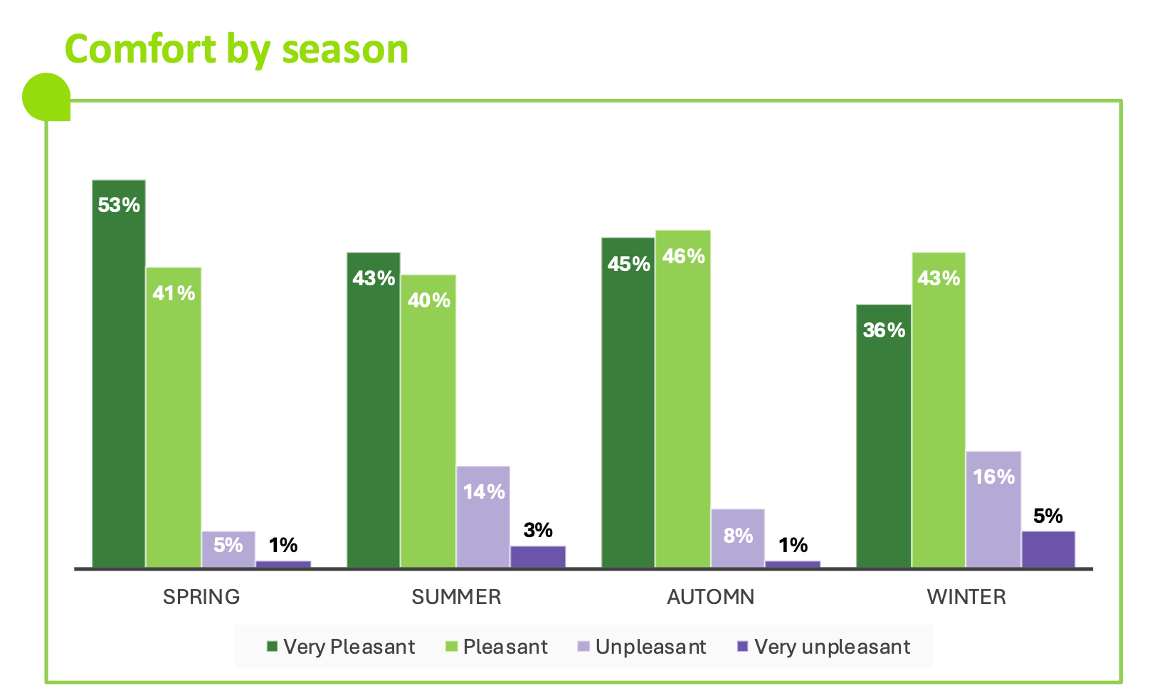 The infographic presents a vertical histogram comparing the perception of comfort in the home according to four seasons: spring, summer, autumn, and winter. For each season, four comfort levels are represented by colored bars: dark green: very pleasant, light green: pleasant, light purple: unpleasant, dark purple: very unpleasant.
The data displayed is:
Spring: 53% very pleasant; 41% pleasant; 5% unpleasant; 1% very unpleasant.
Summer: 43%; 40%; 14%; 3%.
Autumn: 45%; 46%; 8%; 1%.
Winter: 36%; 43%; 16%; 5%.
The distribution shows a generally high comfort level in spring and autumn, while winter presents more discomfort.
The infographic presents a vertical histogram comparing the perception of comfort in the home according to four seasons: spring, summer, autumn, and winter. For each season, four comfort levels are represented by colored bars: dark green: very pleasant, light green: pleasant, light purple: unpleasant, dark purple: very unpleasant.
The data displayed is:
Spring: 53% very pleasant; 41% pleasant; 5% unpleasant; 1% very unpleasant.
Summer: 43%; 40%; 14%; 3%.
Autumn: 45%; 46%; 8%; 1%.
Winter: 36%; 43%; 16%; 5%.
The distribution shows a generally high comfort level in spring and autumn, while winter presents more discomfort.
Fig 22 – Global perception of comfort according to seasons
Download this infographic for your presentations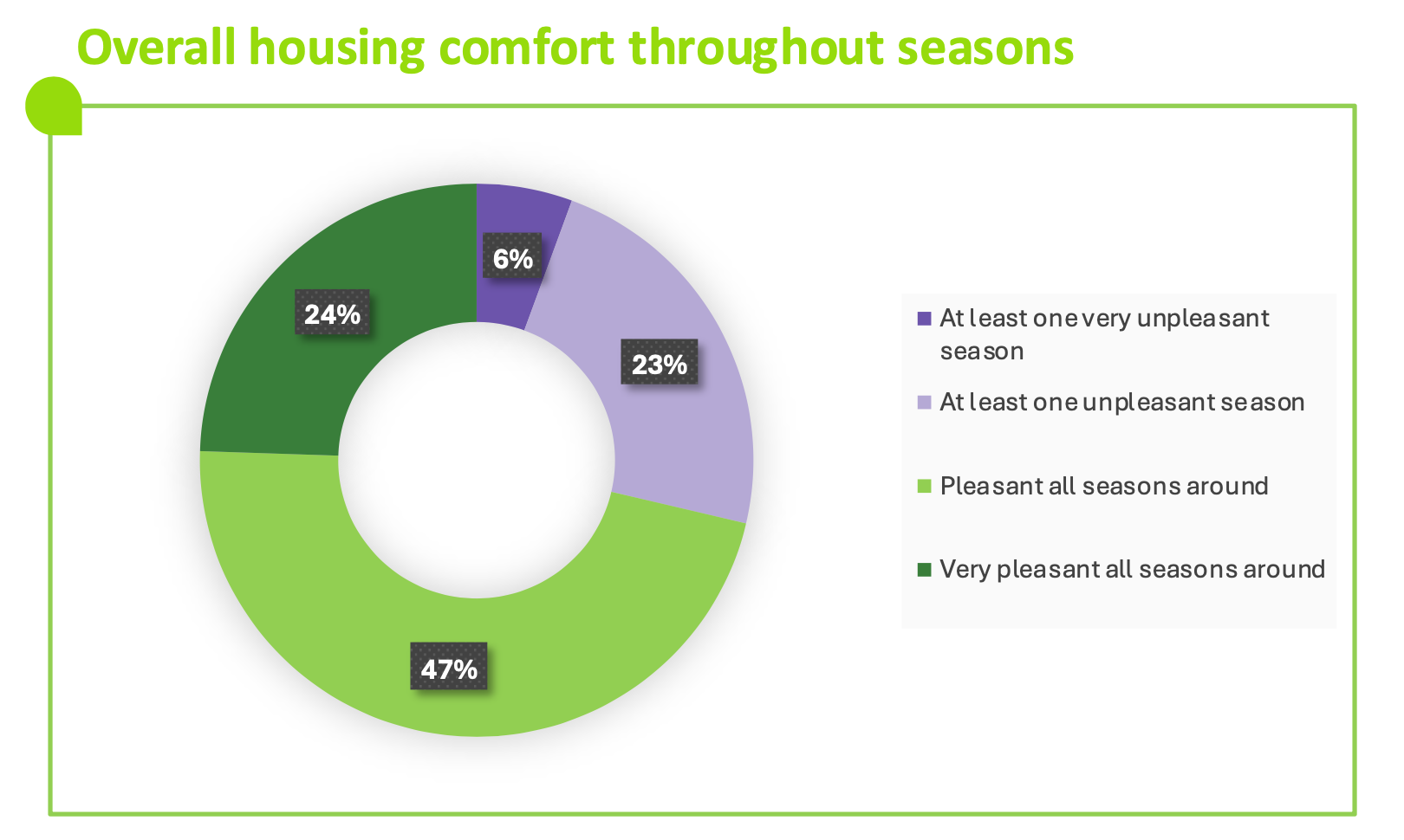 The image presents a ring diagram grouping the levels of comfort felt in the home according to the presence of pleasant or unpleasant seasons. The legend specifies four categories: dark purple: at least one very unpleasant season, light purple: at least one unpleasant season, light green: pleasant in all seasons, dark green: very pleasant in all seasons.
The data displayed is:
At least one very unpleasant season: 6%.
At least one unpleasant season: 23%.
Pleasant in all seasons: 47%.
Very pleasant in all seasons: 24%.
The majority of respondents declares a stable and positive comfort level throughout the year.
The image presents a ring diagram grouping the levels of comfort felt in the home according to the presence of pleasant or unpleasant seasons. The legend specifies four categories: dark purple: at least one very unpleasant season, light purple: at least one unpleasant season, light green: pleasant in all seasons, dark green: very pleasant in all seasons.
The data displayed is:
At least one very unpleasant season: 6%.
At least one unpleasant season: 23%.
Pleasant in all seasons: 47%.
Very pleasant in all seasons: 24%.
The majority of respondents declares a stable and positive comfort level throughout the year.
Habits: The first step that triggers action
- 82% of Europeans say that everyday actions are necessary to reduce energy consumption. (Fig.23)
- If electricity prices doubled by 2030, 30% of Europeans say they would reduce their consumption. (Fig.24)
Fig 23 – Planned actions to reduce energy costs
Download this infographic for your presentations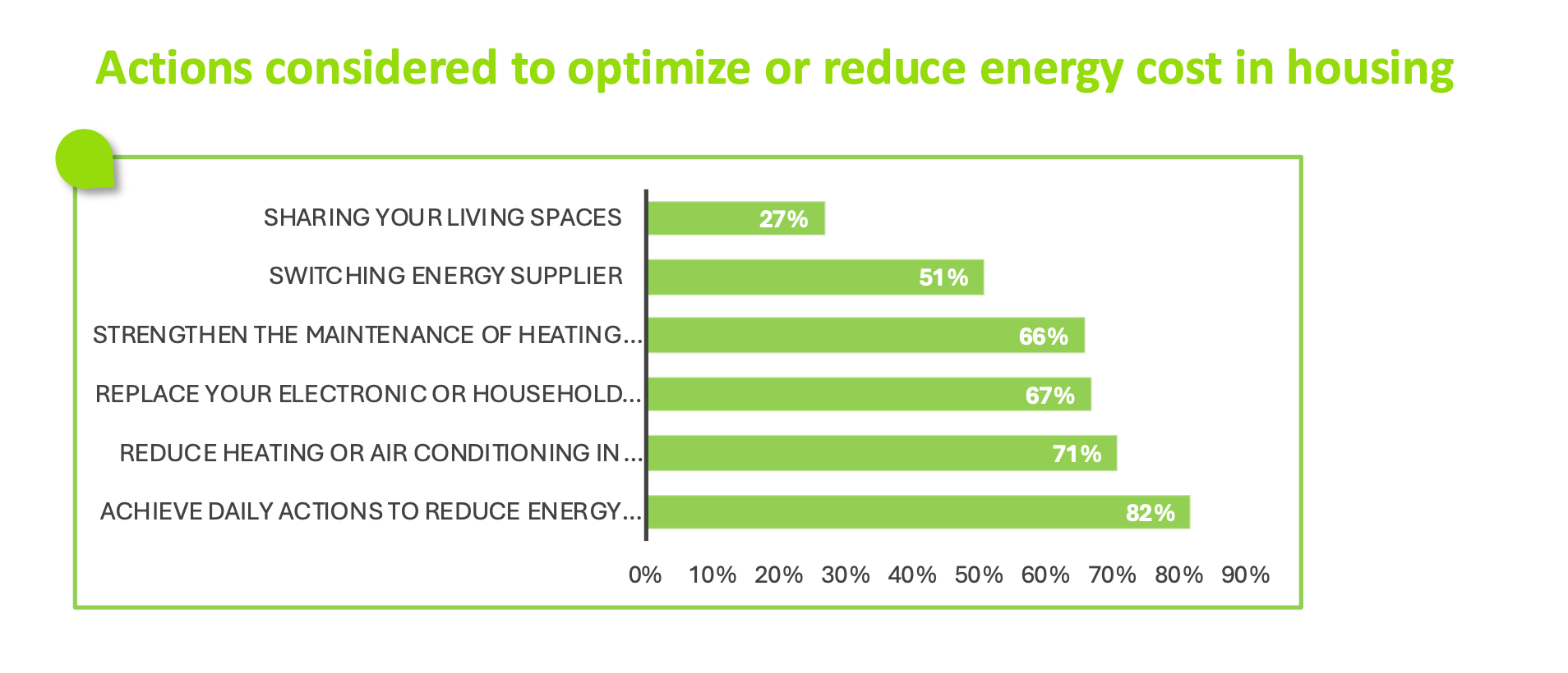 The visual presents a horizontal histogram describing several actions that respondents plan to optimize or reduce their energy consumption costs.
The data displayed is:
Share living spaces: 27%.
Change energy supplier: 51%.
Strengthen equipment maintenance: 66%.
Replace electronic appliances: 67%.
Reduce heating or air conditioning: 71%.
Make daily gestures to save energy: 82%.
Daily gestures and reducing heating/air conditioning appear to be the most frequently planned actions.
The visual presents a horizontal histogram describing several actions that respondents plan to optimize or reduce their energy consumption costs.
The data displayed is:
Share living spaces: 27%.
Change energy supplier: 51%.
Strengthen equipment maintenance: 66%.
Replace electronic appliances: 67%.
Reduce heating or air conditioning: 71%.
Make daily gestures to save energy: 82%.
Daily gestures and reducing heating/air conditioning appear to be the most frequently planned actions.
Fig 24 – Planned actions in case of an increase in the price of electricity
Download this infographic for your presentations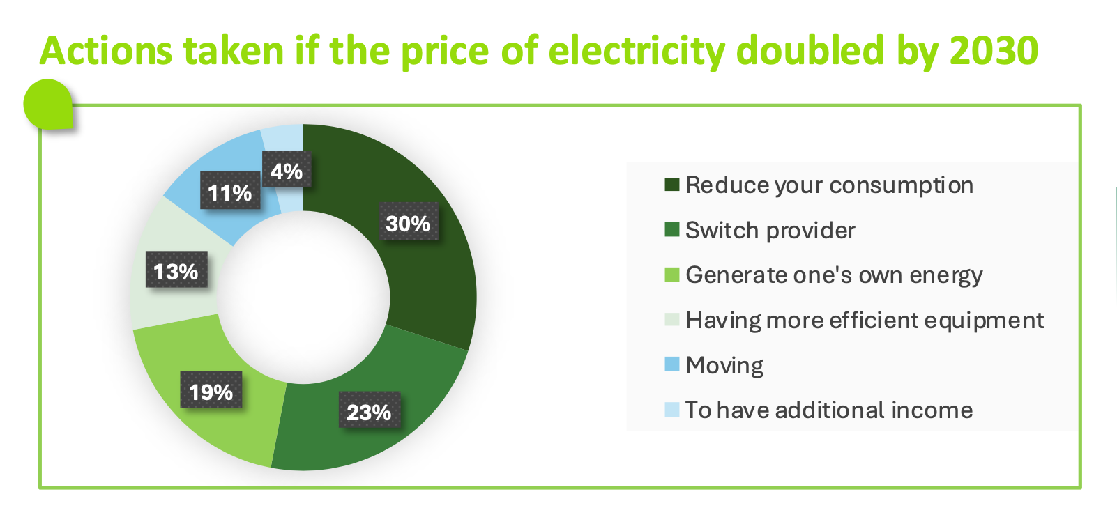 The infographic presents a ring diagram illustrating the actions that respondents would consider if the price of electricity were to double by 2030.
The data displayed is:
Reduce consumption: 30%.
Change supplier: 23%.
Produce own energy: 19%.
Have more efficient equipment: 13%.
No action/not concerned: 11%.
Don’t know: 4%.
The majority plans to reduce consumption or change suppliers, while a significant portion considers self-producing energy or improving equipment.
The infographic presents a ring diagram illustrating the actions that respondents would consider if the price of electricity were to double by 2030.
The data displayed is:
Reduce consumption: 30%.
Change supplier: 23%.
Produce own energy: 19%.
Have more efficient equipment: 13%.
No action/not concerned: 11%.
Don’t know: 4%.
The majority plans to reduce consumption or change suppliers, while a significant portion considers self-producing energy or improving equipment.
A concrete example: When renovation proves its effectiveness
- 66% of Europeans have noticed a decrease in their energy bills after renovation works. (Fig.25)
- 71% of Europeans found that their energy savings after renovation met or exceeded their expectations. (Fig.26)
Fig 25 – Observed decrease in energy bills after work
Download this infographic for your presentations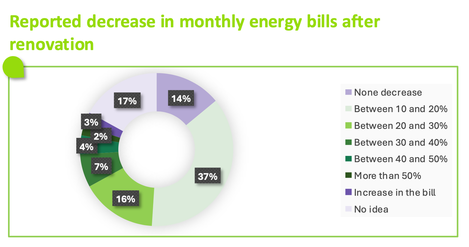 The image shows a ring diagram representing the monthly decrease observed in energy bills after the completion of work.
The data displayed is:
No decrease: 17%.
Between 10% and 20%: 37%.
Between 20% and 30%: 16%.
Between 30% and 40%: 7%.
Between 40% and 50%: 4%.
More than 50%: 2%.
Increase in bill: 3%.
No idea: 14%.
A majority declares a decrease between 10% and 20%, while a small percentage indicates an increase or no decrease.
The image shows a ring diagram representing the monthly decrease observed in energy bills after the completion of work.
The data displayed is:
No decrease: 17%.
Between 10% and 20%: 37%.
Between 20% and 30%: 16%.
Between 30% and 40%: 7%.
Between 40% and 50%: 4%.
More than 50%: 2%.
Increase in bill: 3%.
No idea: 14%.
A majority declares a decrease between 10% and 20%, while a small percentage indicates an increase or no decrease.
Fig 26 – Gap between expected and observed decrease
Download this infographic for your presentations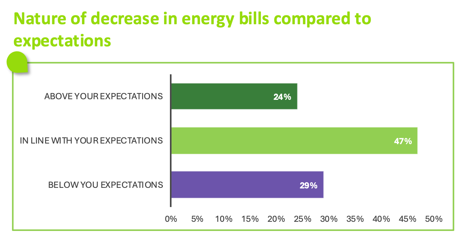 The infographic presents a horizontal histogram comparing the observed decrease in energy bills with the expected decrease by the respondents. Three categories appear.
The data displayed is:
Higher than expected: 24%.
In line with expectations: 47%.
Lower than expected: 29%.
The majority of respondents indicates that the observed decrease corresponds to their expectations, while about a third judges it to be lower or higher than expected.
The infographic presents a horizontal histogram comparing the observed decrease in energy bills with the expected decrease by the respondents. Three categories appear.
The data displayed is:
Higher than expected: 24%.
In line with expectations: 47%.
Lower than expected: 29%.
The majority of respondents indicates that the observed decrease corresponds to their expectations, while about a third judges it to be lower or higher than expected.
The social circle: The decisive role of relatives and professionals
- 75% of Europeans are influenced by their relatives. (Fig.27)
- 70% of Europeans are influenced by professionals. (Fig.27)
Fig 27 – Perceived influence in housing projects
Download this infographic for your presentations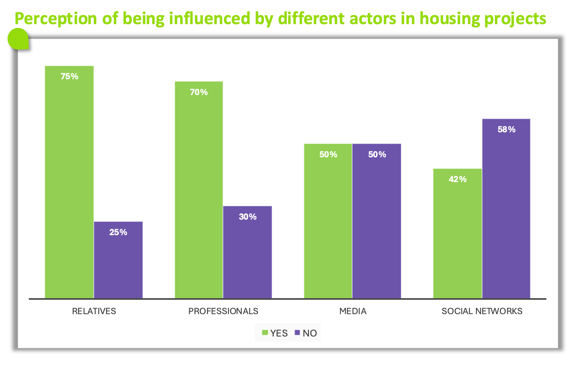 The infographic presents a histogram comparing the proportion of people who claim to be influenced or not by different actors when it comes to housing projects.
The data indicated is:
Close ones: 75% yes, 25% no.
Professionals: 70% yes, 30% no.
Media: 50% yes, 50% no.
Social networks: 42% yes, 58% no.
Close ones and professionals are perceived as the most frequent sources of influence, while social networks appear to be the least influential actor.
The infographic presents a histogram comparing the proportion of people who claim to be influenced or not by different actors when it comes to housing projects.
The data indicated is:
Close ones: 75% yes, 25% no.
Professionals: 70% yes, 30% no.
Media: 50% yes, 50% no.
Social networks: 42% yes, 58% no.
Close ones and professionals are perceived as the most frequent sources of influence, while social networks appear to be the least influential actor.
Education: Informing and guiding to trigger action
- 57% of Europeans consider themselves informed or very informed about the work that exist to reduce energy consumption. (Fig.28)
Fig 28 – Feeling of information on energy-saving work
Download this infographic for your presentations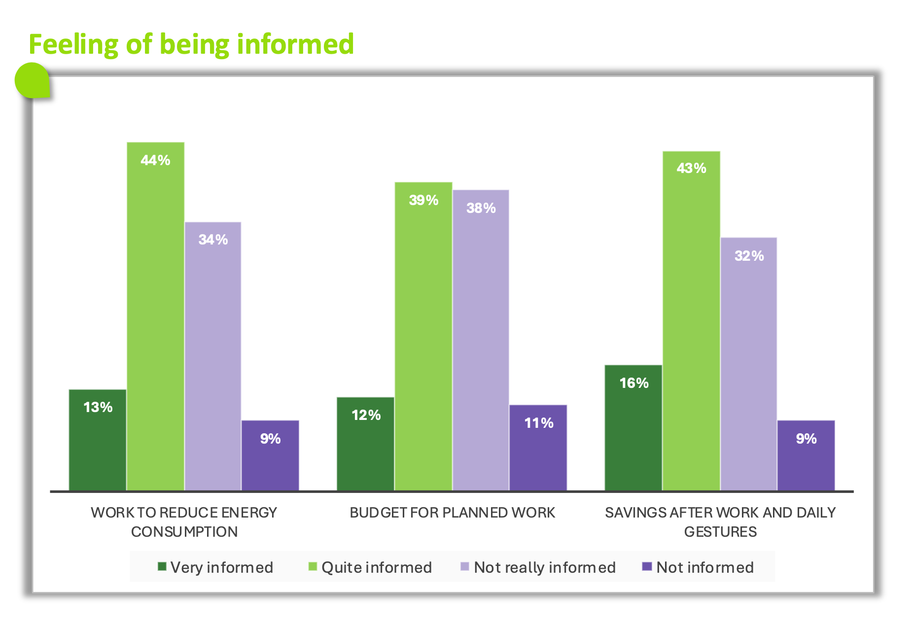 The infographic presents a grouped histogram showing how respondents evaluate their level of information on three topics related to renovation and energy savings.
The data displayed is:
Work to reduce energy consumption
Very well informed: 13%,
Well informed: 44%,
Rather poorly informed: 34%,
Very poorly informed: 9%.
Budget for work to be planned
Very well informed: 12%,
Well informed: 39%,
Rather poorly informed: 38%,
Very poorly informed: 11%.
Savings after work and daily gestures
Very well informed: 16%,
Well informed: 43%,
Rather poorly informed: 32%,
Very poorly informed: 9%.
Overall, the majority says they are well informed, but a significant portion considers themselves rather poorly informed, especially regarding the budget to be planned.
The infographic presents a grouped histogram showing how respondents evaluate their level of information on three topics related to renovation and energy savings.
The data displayed is:
Work to reduce energy consumption
Very well informed: 13%,
Well informed: 44%,
Rather poorly informed: 34%,
Very poorly informed: 9%.
Budget for work to be planned
Very well informed: 12%,
Well informed: 39%,
Rather poorly informed: 38%,
Very poorly informed: 11%.
Savings after work and daily gestures
Very well informed: 16%,
Well informed: 43%,
Rather poorly informed: 32%,
Very poorly informed: 9%.
Overall, the majority says they are well informed, but a significant portion considers themselves rather poorly informed, especially regarding the budget to be planned.
Energy commitment: A lever for property value enhancement
- 88% of Europeans believe that investing in their home impacts or will impact the value of their property. (Fig.29)
- 43% of Europeans declare that investing in their home already impacts the value of their property. (Fig.29)
Fig 29 – Perceived impact of energy performance on real estate value
Download this infographic for your presentations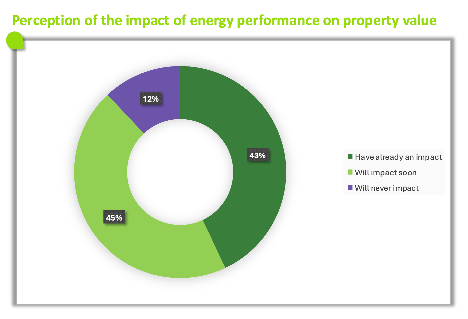 The image presents a ring diagram illustrating the perception of the impact of energy performance on the value of a real estate property.
The data is:
Already has an impact: 43%.
Will have an impact: 45%.
Will never have an impact: 12%.
The majority believes that energy performance already influences, or will influence in the future, the value of a real estate property.
The image presents a ring diagram illustrating the perception of the impact of energy performance on the value of a real estate property.
The data is:
Already has an impact: 43%.
Will have an impact: 45%.
Will never have an impact: 12%.
The majority believes that energy performance already influences, or will influence in the future, the value of a real estate property.
Public aid: A trigger for a majority of homeowners
- 41% of Europeans would give up or reduce renovation works for financial reasons. (Fig.30)
Fig 30 – Actions considered without public aid
Download this infographic for your presentations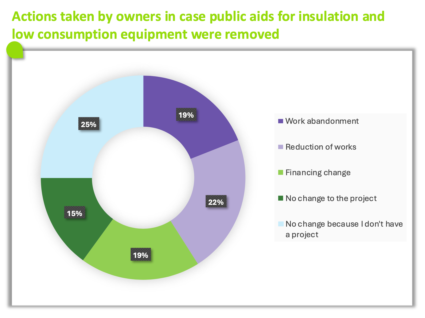 The infographic shows two aligned histograms. The first indicates the interest in a financing solution proposed directly by the company performing the work. The second measures the perceived usefulness of integrated financing in the renovation quote. The values are indicated for all respondents and by country.
Interest in a financing solution proposed by the company
All: 58%.
Germany: 54%.
Belgium: 49%. Spain: 72%.
France: 55%.
Italy: 62%.
Poland: 64%.
Portugal: 56%.
United Kingdom: 52%.
Perceived usefulness of integrated financing in the quote
All: 60%.
Germany: 56%.
Belgium: 50%.
Spain: 74%.
France: 56%.
Italy: 65%.
Poland: 67%.
Portugal: 60%.
United Kingdom: 52%.
The results show a globally high interest and perceived usefulness, particularly in Spain, Poland, and Italy.
The infographic shows two aligned histograms. The first indicates the interest in a financing solution proposed directly by the company performing the work. The second measures the perceived usefulness of integrated financing in the renovation quote. The values are indicated for all respondents and by country.
Interest in a financing solution proposed by the company
All: 58%.
Germany: 54%.
Belgium: 49%. Spain: 72%.
France: 55%.
Italy: 62%.
Poland: 64%.
Portugal: 56%.
United Kingdom: 52%.
Perceived usefulness of integrated financing in the quote
All: 60%.
Germany: 56%.
Belgium: 50%.
Spain: 74%.
France: 56%.
Italy: 65%.
Poland: 67%.
Portugal: 60%.
United Kingdom: 52%.
The results show a globally high interest and perceived usefulness, particularly in Spain, Poland, and Italy.
Integrated financing vs. traditional bank credit
- 58% of Europeans would be interested if the credit offer was proposed directly by the company. (Fig.31)
- 60% of Europeans would find financing integrated directly into renovation quotes useful. (Fig.31)
Fig 31 – Interest in integrated financing for renovation work
Download this infographic for your presentations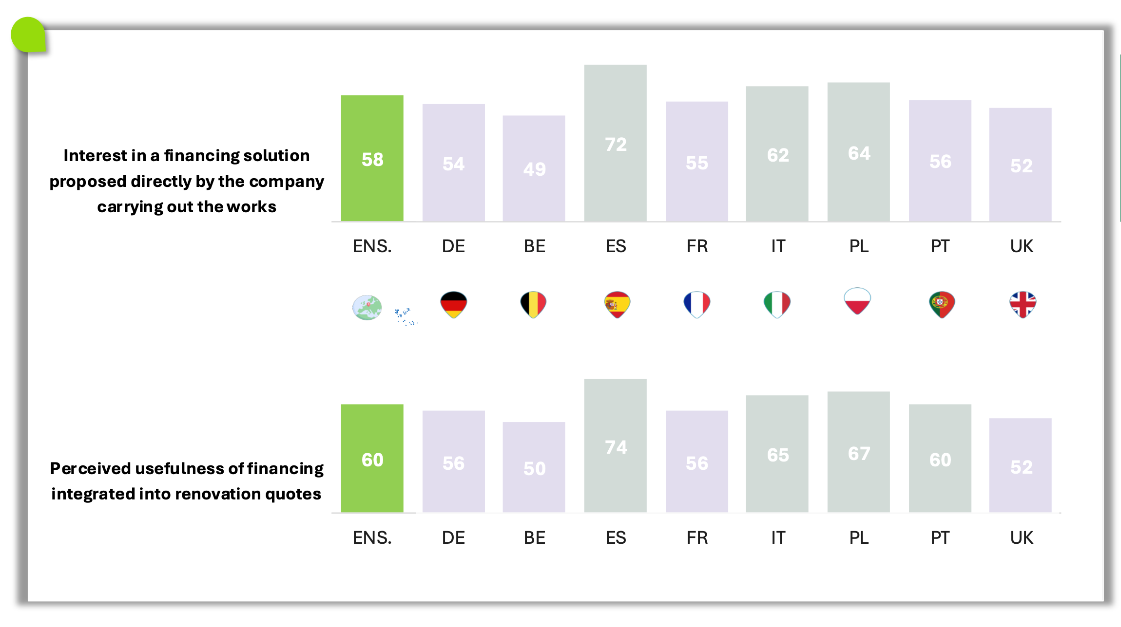 The infographic shows two aligned histograms. The first indicates the interest in a financing solution proposed directly by the company performing the work. The second measures the perceived usefulness of integrated financing in the renovation quote. The values are indicated for all respondents and by country.
Interest in a financing solution proposed by the company
All: 58%.
Germany: 54%.
Belgium: 49%. Spain: 72%.
France: 55%.
Italy: 62%.
Poland: 64%.
Portugal: 56%.
United Kingdom: 52%.
Perceived usefulness of integrated financing in the quote
All: 60%.
Germany: 56%.
Belgium: 50%.
Spain: 74%.
France: 56%.
Italy: 65%.
Poland: 67%.
Portugal: 60%.
United Kingdom: 52%.
The results show a globally high interest and perceived usefulness, particularly in Spain, Poland, and Italy.
The infographic shows two aligned histograms. The first indicates the interest in a financing solution proposed directly by the company performing the work. The second measures the perceived usefulness of integrated financing in the renovation quote. The values are indicated for all respondents and by country.
Interest in a financing solution proposed by the company
All: 58%.
Germany: 54%.
Belgium: 49%. Spain: 72%.
France: 55%.
Italy: 62%.
Poland: 64%.
Portugal: 56%.
United Kingdom: 52%.
Perceived usefulness of integrated financing in the quote
All: 60%.
Germany: 56%.
Belgium: 50%.
Spain: 74%.
France: 56%.
Italy: 65%.
Poland: 67%.
Portugal: 60%.
United Kingdom: 52%.
The results show a globally high interest and perceived usefulness, particularly in Spain, Poland, and Italy.
Attractivity of integrated financing vs. traditional bank credit
Fig 32 – Attractiveness of financing methods
Download this infographic for your presentations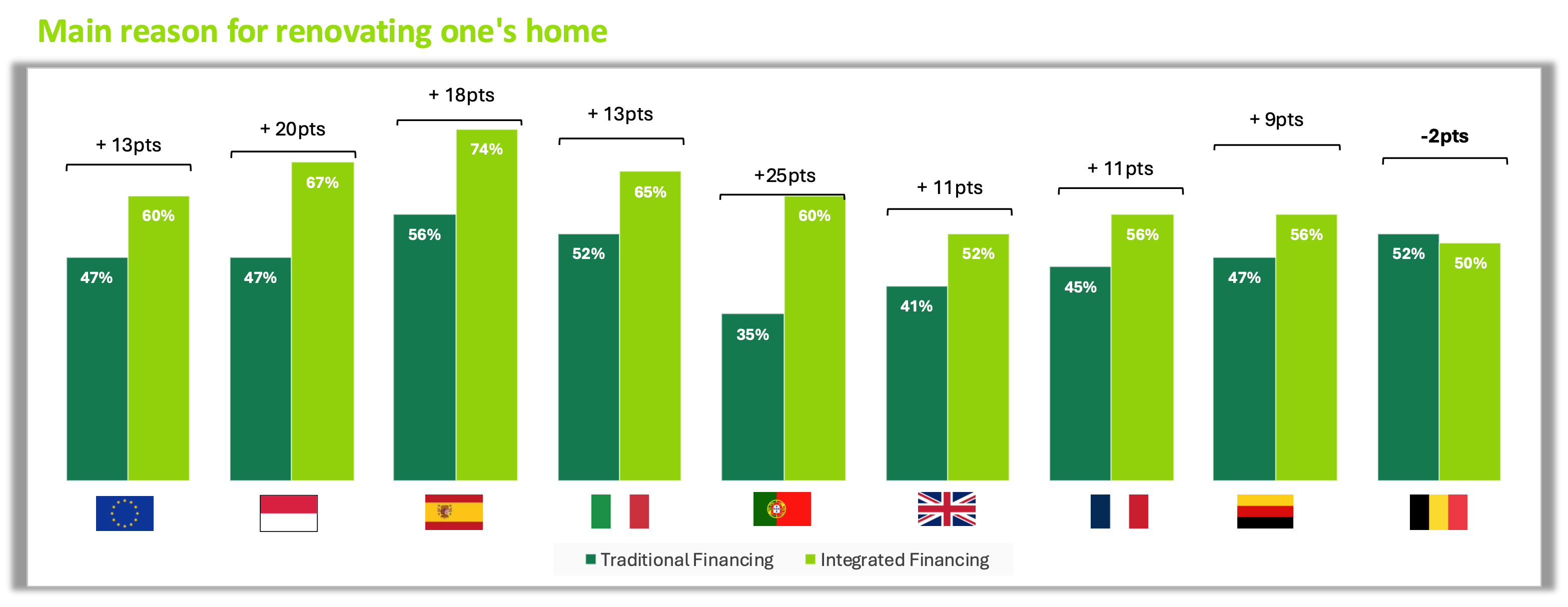 The infographic presents a histogram comparing the proportion of people who consider two financing methods attractive: classic bank credit and integrated financing proposed by the company performing the work. The data is organized by country.
The values displayed are:
European Union: 47% classic financing, 60% integrated financing.
Poland: 47% classic, 67% integrated.
Spain: 56% classic, 74% integrated.
Italy: 52% classic, 65% integrated.
Portugal: 35% classic, 60% integrated.
United Kingdom: 41% classic, 52% integrated.
France: 45% classic, 56% integrated.
Germany: 47% classic, 56% integrated.
Belgium: 52% classic, 50% integrated.
In most countries, integrated financing is perceived as more attractive than classic financing, with significant gaps in Spain, Portugal, and the country represented by the red and white flag. Belgium is the only case where integrated financing is slightly less attractive.
The infographic presents a histogram comparing the proportion of people who consider two financing methods attractive: classic bank credit and integrated financing proposed by the company performing the work. The data is organized by country.
The values displayed are:
European Union: 47% classic financing, 60% integrated financing.
Poland: 47% classic, 67% integrated.
Spain: 56% classic, 74% integrated.
Italy: 52% classic, 65% integrated.
Portugal: 35% classic, 60% integrated.
United Kingdom: 41% classic, 52% integrated.
France: 45% classic, 56% integrated.
Germany: 47% classic, 56% integrated.
Belgium: 52% classic, 50% integrated.
In most countries, integrated financing is perceived as more attractive than classic financing, with significant gaps in Spain, Portugal, and the country represented by the red and white flag. Belgium is the only case where integrated financing is slightly less attractive.
Managing consumption: Regaining control of the transition
- 74% of Europeans are already equipped or are interested in getting equipped. (Fig.33 et Fig.34 et Fig.35)
Fig 33 – Current equipment
Download this infographic for your presentations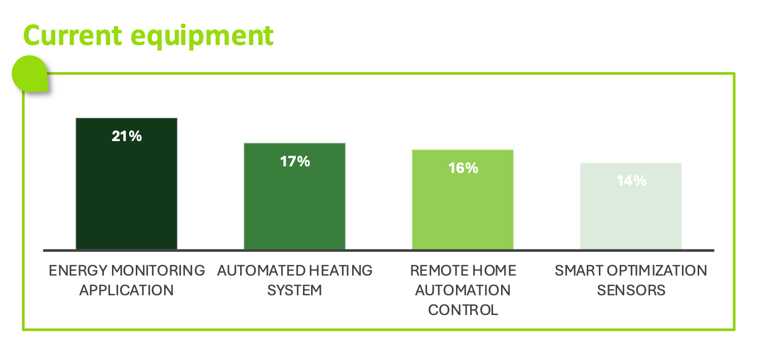 The graph compares the current equipment for four solutions:
Energy tracking application: 21%
Automated heating system: 17%
Remote home automation control: 16%
Intelligent optimization sensors: 14%
No equipment reaches 25%, which shows a relatively low current adoption of these devices.
The graph compares the current equipment for four solutions:
Energy tracking application: 21%
Automated heating system: 17%
Remote home automation control: 16%
Intelligent optimization sensors: 14%
No equipment reaches 25%, which shows a relatively low current adoption of these devices.
Fig 34 – Current equipment and willingness to equip
Download this infographic for your presentations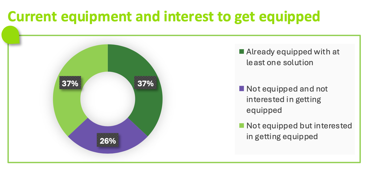 The graph presents three categories:
Already equipped with at least one solution: 37%
Not equipped but interested in equipping: 37%
Not equipped and not interested: 26%
Those already equipped and those interested in equipping are represented in equal proportions, while a quarter of respondents do not plan to equip themselves.
The graph presents three categories:
Already equipped with at least one solution: 37%
Not equipped but interested in equipping: 37%
Not equipped and not interested: 26%
Those already equipped and those interested in equipping are represented in equal proportions, while a quarter of respondents do not plan to equip themselves.
Fig 35 – Planned equipment
Download this infographic for your presentations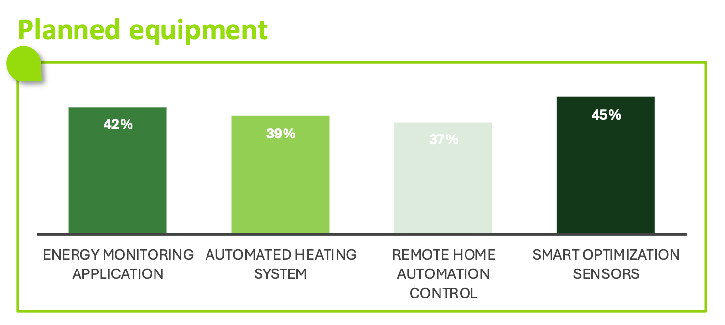 The graph presents the devices that households intend to acquire:
Intelligent optimization sensors: 45%
Energy tracking application: 42%
Automated heating system: 39%
Remote home automation control: 37%
All equipment is considered by a significant proportion of respondents, with a preference for intelligent sensors.
The graph presents the devices that households intend to acquire:
Intelligent optimization sensors: 45%
Energy tracking application: 42%
Automated heating system: 39%
Remote home automation control: 37%
All equipment is considered by a significant proportion of respondents, with a preference for intelligent sensors.
Energy autonomy: From latent dream to possible breakthrough
- 35% of Europeans would be ready to produce their own energy if storage became affordable. (Fig.36 et Fig.37)
Fig 36 – Impact of electricity quotas and tripled prices
Download this infographic for your presentations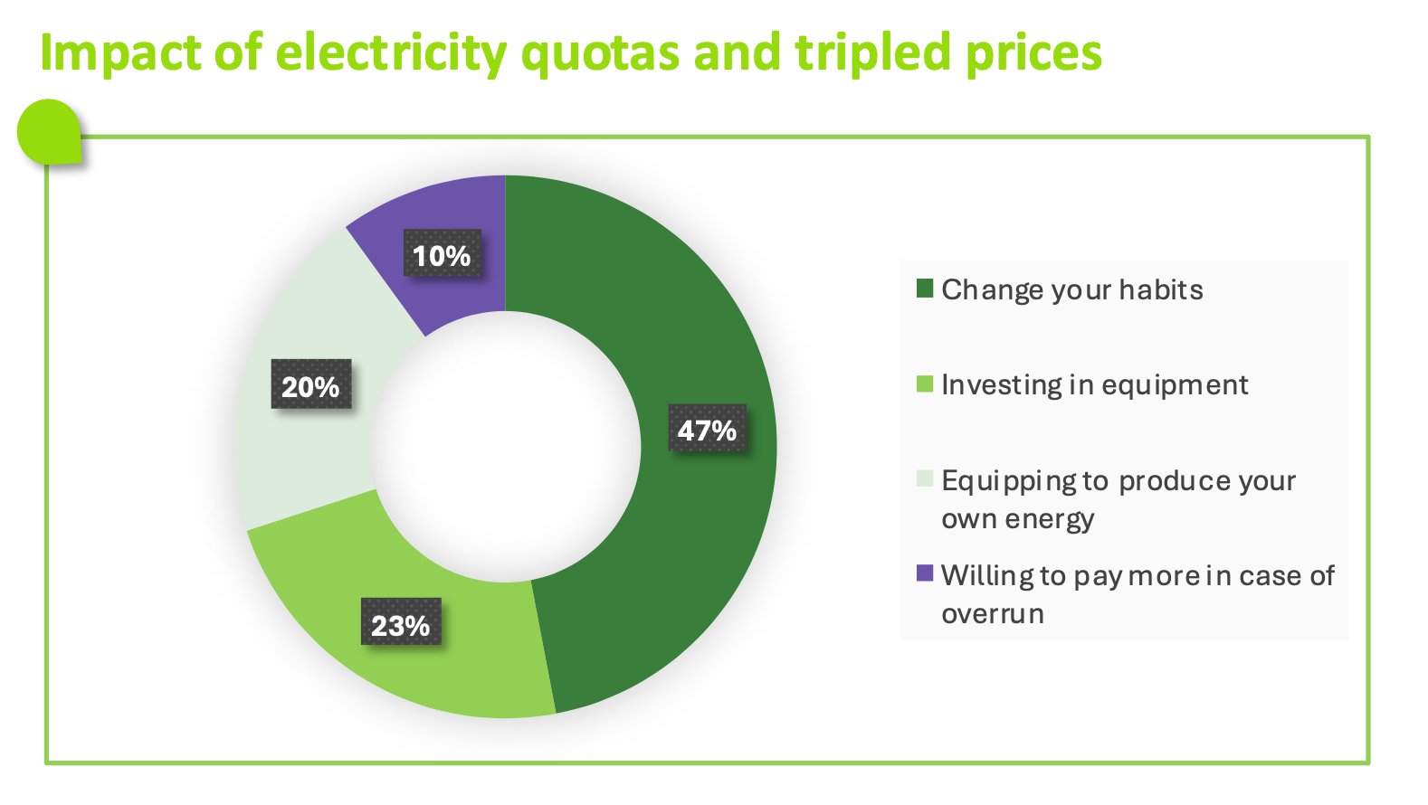 The graph shows four possible responses to a system of electricity quotas combined with tripled prices.
The proportions are as follows:
47% state that they would change their habits.
23% would consider investing in equipment to reduce their consumption.
20% would seek to equip themselves to produce their own energy.
10% would accept paying more in case of excess.
The graph shows four possible responses to a system of electricity quotas combined with tripled prices.
The proportions are as follows:
47% state that they would change their habits.
23% would consider investing in equipment to reduce their consumption.
20% would seek to equip themselves to produce their own energy.
10% would accept paying more in case of excess.
Fig 37 – Impact of affordable storage and efficient solar panels
Download this infographic for your presentations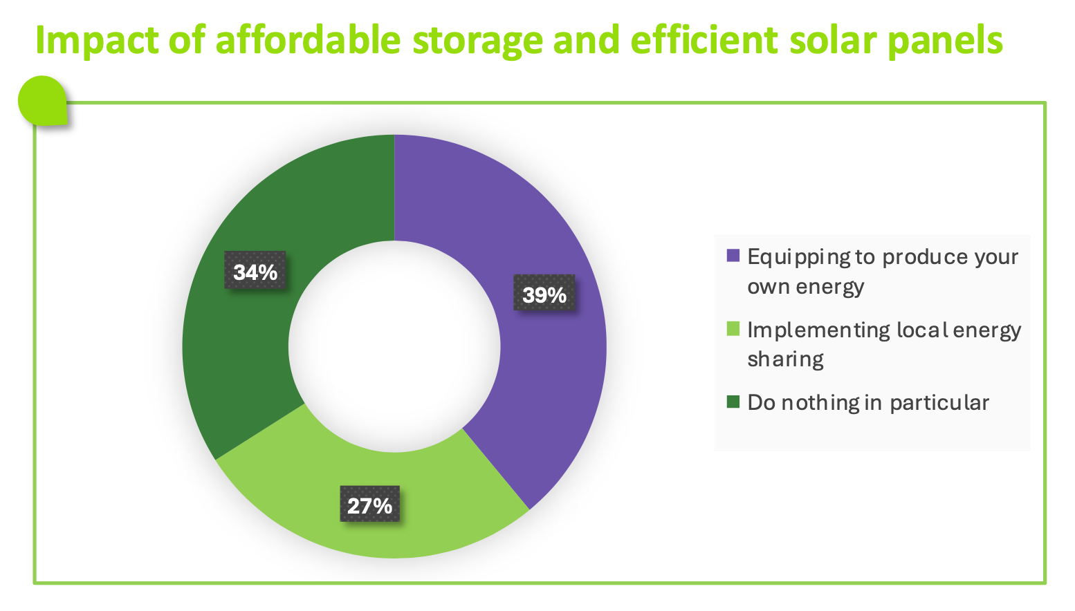 The graph presents three possible options in the event of improved and democratized energy storage and solar panels.
The responses are distributed as follows:
39% would choose to equip themselves to produce their own energy.
27% would consider setting up a local energy sharing system.
34% state that they would do nothing.
The graph presents three possible options in the event of improved and democratized energy storage and solar panels.
The responses are distributed as follows:
39% would choose to equip themselves to produce their own energy.
27% would consider setting up a local energy sharing system.
34% state that they would do nothing.