Purchasing power is under threat from inflation


In terms of purchasing power, things are looking better overall
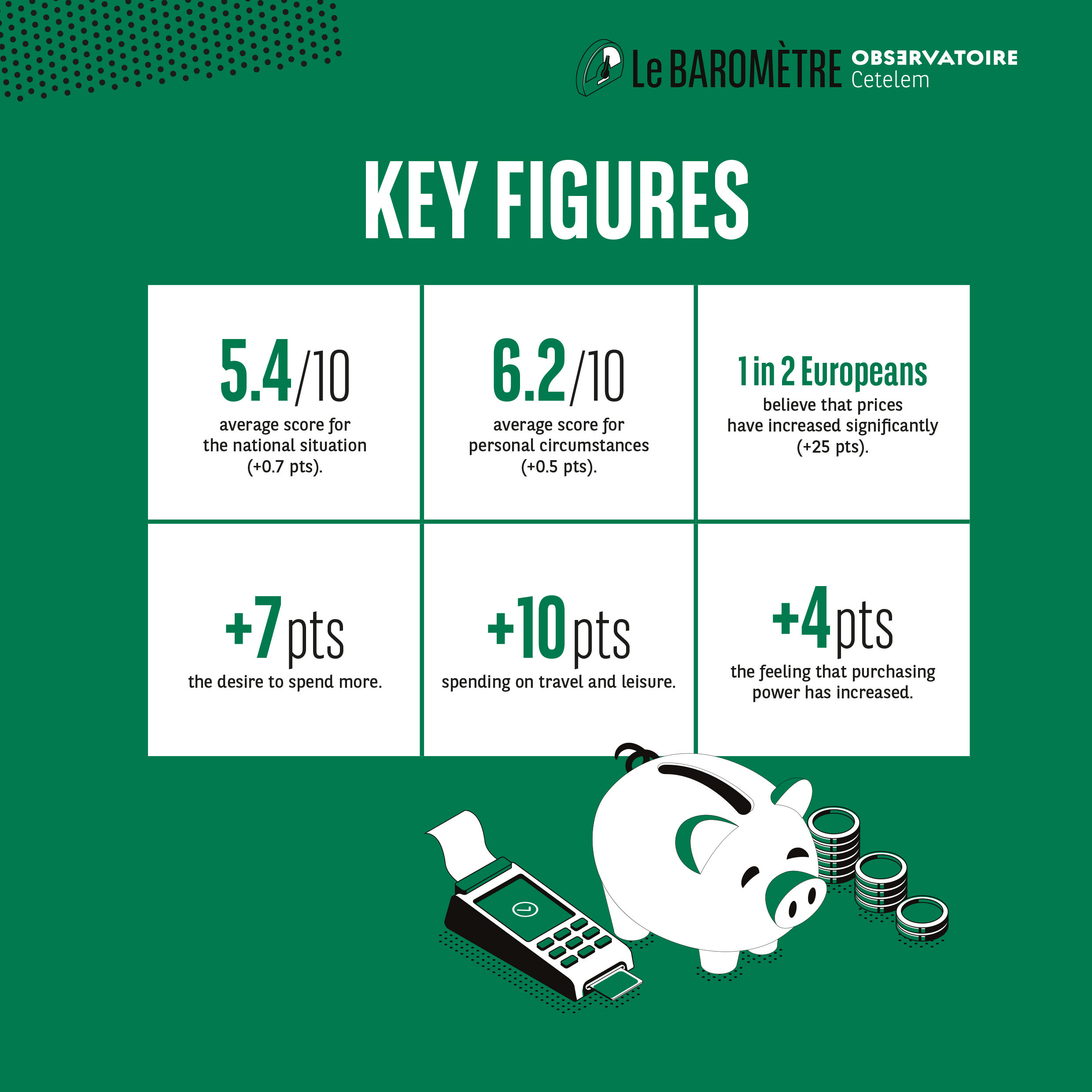
This 2022 Observatoire Cetelem Barometer reveals a more significant change in the opinions of Europeans when asked about their purchasing power, which they have traditionally considered to have declined with each successive survey (Fig. 10 Barometer / Context). The feeling that it has increased is up 4 points, while the belief that it has fallen is down 3 points. The proportion of Europeans who feel that nothing has changed has remained more or less stable (-1 pt).
Fig. 10 Evolution of consumption and purchasing power in the euro zone
Download this infographic for your presentations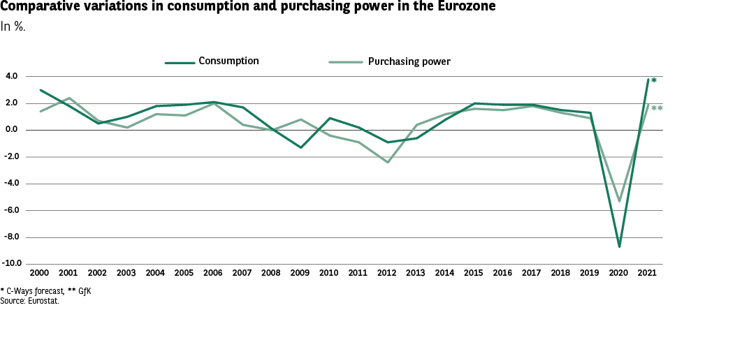 The graph presents the annual evolution (in %) of two indicators in the euro zone: • household consumption, • purchasing power, from 2000 to 2021.
The objective is to visualize the trends, periods of growth or decline, and the impact of recent economic shocks (notably 2020).
The asterisks at the end of the curve indicate: • C*Ways forecast ** GfK The visual marks (lines, colors) are decorative and have no particular meaning beyond differentiating the curves.
Source: Eurostat.
Key Visuals • Two curves: • Consumption (dark green) • Purchasing power (light green) • Vertical axis: annual variations in %, from +4% to -10%. • Horizontal axis: years from 2000 to 2021. • A major negative peak in 2020, followed by a strong rebound in 2021.
2000–2007: • Consumption and purchasing power fluctuate globally between +1% and +3%. • Some deviations, but the two curves remain close.
2008–2013 (financial crisis and sovereign debt): • Sharp decline around 2009, close to -2% to -3%. • Slight recovery
2010-2011, then new decline around 2012-2013.
2014–2019: • Return to a slightly positive zone (0% to +2%). • Consumption slightly higher than purchasing power over several years.
2020: • Simultaneous collapse of the two indicators: around -8% for consumption and -4% for purchasing power. • This is the lowest point in the series.
2021: • Very strong rebound, above +4% for consumption, and around +2.5% to +3% for purchasing power.
Enseignement principal
The two indicators follow a similar dynamic over 20 years, with: • Moderate variations in “normal” periods; • Two clear crises: 2009 and 2020; • A historic decline in 2020, with the largest decline in the series; • A marked rebound in 2021, stronger for consumption than for purchasing power.
This evolution highlights the great sensitivity of the two indicators to major economic shocks.
The graph presents the annual evolution (in %) of two indicators in the euro zone: • household consumption, • purchasing power, from 2000 to 2021.
The objective is to visualize the trends, periods of growth or decline, and the impact of recent economic shocks (notably 2020).
The asterisks at the end of the curve indicate: • C*Ways forecast ** GfK The visual marks (lines, colors) are decorative and have no particular meaning beyond differentiating the curves.
Source: Eurostat.
Key Visuals • Two curves: • Consumption (dark green) • Purchasing power (light green) • Vertical axis: annual variations in %, from +4% to -10%. • Horizontal axis: years from 2000 to 2021. • A major negative peak in 2020, followed by a strong rebound in 2021.
2000–2007: • Consumption and purchasing power fluctuate globally between +1% and +3%. • Some deviations, but the two curves remain close.
2008–2013 (financial crisis and sovereign debt): • Sharp decline around 2009, close to -2% to -3%. • Slight recovery
2010-2011, then new decline around 2012-2013.
2014–2019: • Return to a slightly positive zone (0% to +2%). • Consumption slightly higher than purchasing power over several years.
2020: • Simultaneous collapse of the two indicators: around -8% for consumption and -4% for purchasing power. • This is the lowest point in the series.
2021: • Very strong rebound, above +4% for consumption, and around +2.5% to +3% for purchasing power.
Enseignement principal
The two indicators follow a similar dynamic over 20 years, with: • Moderate variations in “normal” periods; • Two clear crises: 2009 and 2020; • A historic decline in 2020, with the largest decline in the series; • A marked rebound in 2021, stronger for consumption than for purchasing power.
This evolution highlights the great sensitivity of the two indicators to major economic shocks.
In all countries, the perception that purchasing power has increased is palpable, with the Spanish and the Swedes being the most likely to hold this view. Only in Austria is there a degree of stability. At the risk of repeating ourselves, these figures are lower overall than those reported in the 2019 edition, prior to the Covid crisis.
Disparities between the nations are much more significant when it comes to the decline in purchasing power, with a clear geographical divide emerging once again. While 46% of Romanians and Hungarians point to a drop in purchasing power, the Swedes (22%) and the Danes (25%) are much less vocal on this issue. The French, for their part, still hold a negative perception, with a score of 40%.
The spectre of inflation haunts Europeans once more
A development that is closely linked to purchasing power, as well as being a central aspect of this 2022 Barometer, is the sharp increase in the perception that prices are on the rise. 1 in 2 Europeans are now of the belief that prices have increased significantly (+25 pts) (Fig. 11 Barometer).
Fig. 11 Perception of the overall evolution of prices
Download this infographic for your presentations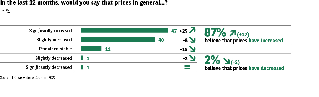 The infographic presents the responses of consumers on the evolution of prices over the last 12 months, expressed as a percentage. Respondents evaluate whether prices have increased, remained stable, or decreased.
Two summary indicators complement the graph:
• 87% declare that prices have increased.
• 2% declare that prices have decreased.
The arrows indicating an increase or decrease are purely decorative.
Source: Observatoire Cetelem 2022.
Éléments visuels clés • Five horizontal bars for each category. • A general subtotal “Prices have increased”. • A subtotal “Prices have decreased”. • All bars use the same green color (no additional visual code).
Data Transcription
Category Percentage Have
increased significantly 47%
Have increased somewhat 40%
Remained stable 11%
Have decreased somewhat 1%
Have decreased significantly 1%
Synthesys: • 87% (+17) estimate that prices have increased • 2% (-2) estimate that prices have decreased
Enseignement principal
The perception of a generalized price increase is overwhelming: nearly nine out of ten Europeans consider that prices have increased. The proportion of people perceiving an increase is increasing strongly (+17 points), while the perception of a decrease is becoming marginal (2%).
This infographic illustrates a very clear awareness of the inflationary phenomenon in the population.
The infographic presents the responses of consumers on the evolution of prices over the last 12 months, expressed as a percentage. Respondents evaluate whether prices have increased, remained stable, or decreased.
Two summary indicators complement the graph:
• 87% declare that prices have increased.
• 2% declare that prices have decreased.
The arrows indicating an increase or decrease are purely decorative.
Source: Observatoire Cetelem 2022.
Éléments visuels clés • Five horizontal bars for each category. • A general subtotal “Prices have increased”. • A subtotal “Prices have decreased”. • All bars use the same green color (no additional visual code).
Data Transcription
Category Percentage Have
increased significantly 47%
Have increased somewhat 40%
Remained stable 11%
Have decreased somewhat 1%
Have decreased significantly 1%
Synthesys: • 87% (+17) estimate that prices have increased • 2% (-2) estimate that prices have decreased
Enseignement principal
The perception of a generalized price increase is overwhelming: nearly nine out of ten Europeans consider that prices have increased. The proportion of people perceiving an increase is increasing strongly (+17 points), while the perception of a decrease is becoming marginal (2%).
This infographic illustrates a very clear awareness of the inflationary phenomenon in the population.
And barely more than 1 in 10 believe that they have remained stable or fallen. It is worth remembering that respondents were interviewed between 5 and 19 November 2021. Throughout the summer and again when schools went back in September, much of the news revolved around rising prices, particularly those of raw materials, which in turn have had an impact on fuel and heating costs. And the statistical data has reflected a notable uptick in inflation as a whole. This was a topic that inevitably gained further traction as we entered the winter months and the health situation once more became a major concern.
Looking at the average score, it is obvious that the impression that prices are rising is shared in many countries, with those in Eastern Europe once again unified in expressing considerable pessimism (Fig. 12 Barometer). Thus, 8 out of 10 Bulgarians report a substantial increase (in other countries in the region the average figure is 7 out of 10), while conversely, fewer than 3 in 10 Swedes and Danes are of this view. Interestingly, with “only” 34% of consumers flagging a marked increase in prices, the French are not among the most pessimistic on this issue. However, it is worth underlining that inflation in France was lower than in many other European countries at the time of the survey in November (Fig. 13 Barometer / Context). This goes some way to explaining such an unusual degree of contentment.
Fig. 12 Perception of price increases by country
Download this infographic for your presentations This table presents, country by country, the perception of the overall evolution of prices over the last 12 months.
The data are expressed as a percentage of people declaring “Yes, prices have increased”, or belonging to one of the five categories:
• Have increased significantly
• Have increased somewhat
• Remained stable
• Have decreased (somewhat / significantly)
The flags are decorative and have no other meaning than identifying the countries.
Source: Observatoire Cetelem 2022.
Key Visuals Elements
The table includes for 15 countries:
• a subtotal “increased” (sum of “increased significantly” + “increased somewhat”),
• the distribution between: increased significantly / increased somewhat,
• the proportion of people estimating that prices have remained stable,
• the proportion estimating a decrease.
The horizontal bars are decorative (illustration of proportion).
Data Transcription
Country Subtotal increased
Have increased significantly
Have increased somewhat
Stable Decreased
Germany 87 53 34 11 2
Austria 91 53 38 9 0
Belgium 88 46 42 10 2
Bulgaria 96 80 16 3 1
Denmark 79 29 50 20 1
Spain 86 48 38 12 2
France 87 34 53 12 1
Hungary 95 73 22 4 1
Italy 86 40 46 13 1
Norway 85 34 51 14 1
Poland 88 71 17 10 2
Portugal 95 51 44 5 0
Czech Republic 95 62 33 4 1
Romania 92 69 23 4 1
United Kingdom 86 32 54 14 1
Slovakia 93 67 26 5 1
Sweden 80 24
The perception of a price increase is extremely dominant in all European countries:
• Between 79% and 96% of respondents declare that prices have increased.
• The countries with the highest levels are: Bulgaria (96%), Hungary (95%), Portugal (95%), Czech Republic (95%).
• Perceptions of stability remain minority (3% to 20% depending on the country).
• The perception of a decrease is almost non-existent (0% to 2%).
This very strong homogeneity confirms a widely shared European perception of generalized inflation.
This table presents, country by country, the perception of the overall evolution of prices over the last 12 months.
The data are expressed as a percentage of people declaring “Yes, prices have increased”, or belonging to one of the five categories:
• Have increased significantly
• Have increased somewhat
• Remained stable
• Have decreased (somewhat / significantly)
The flags are decorative and have no other meaning than identifying the countries.
Source: Observatoire Cetelem 2022.
Key Visuals Elements
The table includes for 15 countries:
• a subtotal “increased” (sum of “increased significantly” + “increased somewhat”),
• the distribution between: increased significantly / increased somewhat,
• the proportion of people estimating that prices have remained stable,
• the proportion estimating a decrease.
The horizontal bars are decorative (illustration of proportion).
Data Transcription
Country Subtotal increased
Have increased significantly
Have increased somewhat
Stable Decreased
Germany 87 53 34 11 2
Austria 91 53 38 9 0
Belgium 88 46 42 10 2
Bulgaria 96 80 16 3 1
Denmark 79 29 50 20 1
Spain 86 48 38 12 2
France 87 34 53 12 1
Hungary 95 73 22 4 1
Italy 86 40 46 13 1
Norway 85 34 51 14 1
Poland 88 71 17 10 2
Portugal 95 51 44 5 0
Czech Republic 95 62 33 4 1
Romania 92 69 23 4 1
United Kingdom 86 32 54 14 1
Slovakia 93 67 26 5 1
Sweden 80 24
The perception of a price increase is extremely dominant in all European countries:
• Between 79% and 96% of respondents declare that prices have increased.
• The countries with the highest levels are: Bulgaria (96%), Hungary (95%), Portugal (95%), Czech Republic (95%).
• Perceptions of stability remain minority (3% to 20% depending on the country).
• The perception of a decrease is almost non-existent (0% to 2%).
This very strong homogeneity confirms a widely shared European perception of generalized inflation.
Fig. 13 Average annual inflation in 17 European countries
Download this infographic for your presentations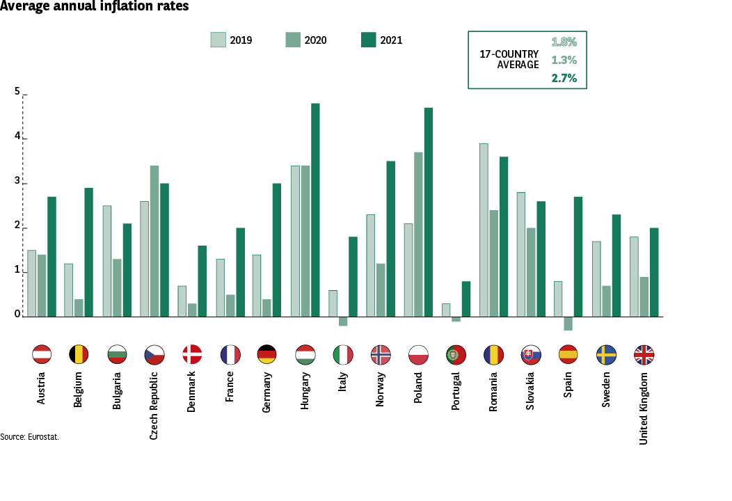 This infographic compares the average annual inflation rates for 17 European countries over three years: • 2019 • 2020 • 2021
Each country is represented by three vertical bars (one per year). The colors are purely differentiating (no additional meaning).
A global average is provided for the 17 countries: • 1.3% in 2019 • 1.3% in 2020 • 2.7% in 2021
Source: Eurostat.
Key Visuals Elements
• Three series of vertical bars per country (2019, 2020, 2021).
• The exact values are not indicated country by country, but the heights allow comparing the trends. • Several countries exceed 4% inflation in 2021.
• The 2021 bars are systematically the highest, confirming a generalized increase.
Trends Transcriptions
Germany 2019 ≈ 1.5% — 2020 ≈ 1% — 2021 ≈ 3%
Austria 2019 ≈ 1.5% — 2020 ≈ 1.3% — 2021 ≈ 2.8%
Belgium 2019 ≈ 1.2% — 2020 ≈ 1% — 2021 ≈ 2.5%
Bulgaria 2019 ≈ 3% — 2020 ≈ 1.2% — 2021 ≈ 2.8%
Denmark 2019 ≈ 0.8% — 2020 ≈ 0.4% — 2021 ≈ 1.8%
Spain 2019 ≈ 0.8% — 2020 ≈ -0.3% — 2021 ≈ 3.3%
France 2019 ≈ 1.3% — 2020 ≈ 0.5% — 2021 ≈ 2.2%
Hungary 2019 ≈ 3.4% — 2020 ≈ 3.3% — 2021 ≈ 5%
Italy 2019 ≈ 0.6% — 2020 ≈ -0.2% — 2021 ≈ 1.8%
Norway 2019 ≈ 2.2% — 2020 ≈ 1.3% — 2021 ≈ 3.2%
Poland 2019 ≈ 2.3% — 2020 ≈ 3.4% — 2021 ≈ 5%
Portugal 2019 ≈ 0.3% — 2020 ≈ -0.2% — 2021 ≈ 1.5%
Czech Republic 2019 ≈ 2.8% — 2020 ≈ 3.2% — 2021 ≈ 4.2%
Romania 2019 ≈ 3% — 2020 ≈ 2.2% — 2021 ≈ 3.5%
United Kingdom 2019 ≈ 1.6% — 2020 ≈ 0.8% — 2021 ≈ 2.6%
Slovakia 2019 ≈ 2.6% — 2020 ≈ 1.9% — 2021 ≈ 3%
Sweden 2019 ≈ 1.5% — 2020 ≈ 0.5% — 2021 ≈ 2.3%
Annual inflation increases significantly in 2021 in all countries, after two relatively moderate years (2019 and 2020). The countries with the strongest increases in 2021 are: • Hungary (≈5%) • Poland (≈5%) • Czech Republic (≈4.2%)
Many countries move from almost zero or negative inflation in 2020 to strong inflation in 2021, revealing a generalized acceleration of inflationary tensions in Europe.
This infographic compares the average annual inflation rates for 17 European countries over three years: • 2019 • 2020 • 2021
Each country is represented by three vertical bars (one per year). The colors are purely differentiating (no additional meaning).
A global average is provided for the 17 countries: • 1.3% in 2019 • 1.3% in 2020 • 2.7% in 2021
Source: Eurostat.
Key Visuals Elements
• Three series of vertical bars per country (2019, 2020, 2021).
• The exact values are not indicated country by country, but the heights allow comparing the trends. • Several countries exceed 4% inflation in 2021.
• The 2021 bars are systematically the highest, confirming a generalized increase.
Trends Transcriptions
Germany 2019 ≈ 1.5% — 2020 ≈ 1% — 2021 ≈ 3%
Austria 2019 ≈ 1.5% — 2020 ≈ 1.3% — 2021 ≈ 2.8%
Belgium 2019 ≈ 1.2% — 2020 ≈ 1% — 2021 ≈ 2.5%
Bulgaria 2019 ≈ 3% — 2020 ≈ 1.2% — 2021 ≈ 2.8%
Denmark 2019 ≈ 0.8% — 2020 ≈ 0.4% — 2021 ≈ 1.8%
Spain 2019 ≈ 0.8% — 2020 ≈ -0.3% — 2021 ≈ 3.3%
France 2019 ≈ 1.3% — 2020 ≈ 0.5% — 2021 ≈ 2.2%
Hungary 2019 ≈ 3.4% — 2020 ≈ 3.3% — 2021 ≈ 5%
Italy 2019 ≈ 0.6% — 2020 ≈ -0.2% — 2021 ≈ 1.8%
Norway 2019 ≈ 2.2% — 2020 ≈ 1.3% — 2021 ≈ 3.2%
Poland 2019 ≈ 2.3% — 2020 ≈ 3.4% — 2021 ≈ 5%
Portugal 2019 ≈ 0.3% — 2020 ≈ -0.2% — 2021 ≈ 1.5%
Czech Republic 2019 ≈ 2.8% — 2020 ≈ 3.2% — 2021 ≈ 4.2%
Romania 2019 ≈ 3% — 2020 ≈ 2.2% — 2021 ≈ 3.5%
United Kingdom 2019 ≈ 1.6% — 2020 ≈ 0.8% — 2021 ≈ 2.6%
Slovakia 2019 ≈ 2.6% — 2020 ≈ 1.9% — 2021 ≈ 3%
Sweden 2019 ≈ 1.5% — 2020 ≈ 0.5% — 2021 ≈ 2.3%
Annual inflation increases significantly in 2021 in all countries, after two relatively moderate years (2019 and 2020). The countries with the strongest increases in 2021 are: • Hungary (≈5%) • Poland (≈5%) • Czech Republic (≈4.2%)
Many countries move from almost zero or negative inflation in 2020 to strong inflation in 2021, revealing a generalized acceleration of inflationary tensions in Europe.
Since the last pre-crisis edition of the Barometer in 2019, however, geographical perceptions have been turned on their head (Fig. 14 Barometer). The feeling that prices have risen is more prevalent in Western Europe, although significant differences can be observed (+16 pts in Italy, +14 pts in Germany and Portugal).
Fig. 14 Evolution of prices according to European countries
Download this infographic for your presentations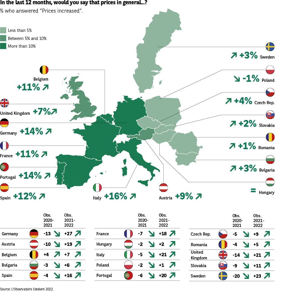 The infographic presents the general evolution of prices by European country over the last 12 months, through:
• a map indicating the proportion of people judging that prices have increased,
• and a table detailing these values, expressed as a percentage.
Source: Observatoire Cetelem 2022.
The colors of the map (green → dark green gradient) indicate only the intensity of the increase. They have no additional meaning.
Key Visuals Elements
• A map of Europe colored according to the intensity of the perceived price increase (from 79% to 96%). • A associated table reproducing the same values in textual form.
• No functional pictograms; flags and icons are decorative.
Board Transcription
Country Subtotal “prices have increased”
Germany 87%
Austria 91%
Belgium 88%
Bulgaria 96%
Denmark 79%
Spain 86%
France 87%
Hungary 95%
Italy 86%
Norway 85%
Poland 88%
Portugal 95%
Czech Republic 95%
Romania 92%
United Kingdom 86%
Slovakia 93%
Sweden 80%
The perception of a price increase is almost unanimous in Europe:
• Scores range from 79% to 96%, which is exceptional homogeneity.
• The highest countries exceed 95%: Bulgaria, Portugal, Czech Republic, Hungary.
• The only countries below 85% are Denmark (79%) and Sweden (80%), but remain very high.
This map confirms that the inflationary sentiment is massive, generalized, and shared across all European countries studied.
The infographic presents the general evolution of prices by European country over the last 12 months, through:
• a map indicating the proportion of people judging that prices have increased,
• and a table detailing these values, expressed as a percentage.
Source: Observatoire Cetelem 2022.
The colors of the map (green → dark green gradient) indicate only the intensity of the increase. They have no additional meaning.
Key Visuals Elements
• A map of Europe colored according to the intensity of the perceived price increase (from 79% to 96%). • A associated table reproducing the same values in textual form.
• No functional pictograms; flags and icons are decorative.
Board Transcription
Country Subtotal “prices have increased”
Germany 87%
Austria 91%
Belgium 88%
Bulgaria 96%
Denmark 79%
Spain 86%
France 87%
Hungary 95%
Italy 86%
Norway 85%
Poland 88%
Portugal 95%
Czech Republic 95%
Romania 92%
United Kingdom 86%
Slovakia 93%
Sweden 80%
The perception of a price increase is almost unanimous in Europe:
• Scores range from 79% to 96%, which is exceptional homogeneity.
• The highest countries exceed 95%: Bulgaria, Portugal, Czech Republic, Hungary.
• The only countries below 85% are Denmark (79%) and Sweden (80%), but remain very high.
This map confirms that the inflationary sentiment is massive, generalized, and shared across all European countries studied.
The fact that these results co-exist with an impression among Europeans that their purchasing power has remained stable indicates that, when it comes to weighing up what has happened in the past and what might occur in the future, the economic sense and rationality of consumers is often more sophisticated than they are given credit for. One would wager that barring a sudden inversion of price trends next year, which seems unlikely, by then many more Europeans will feel that their purchasing power has deteriorated.
Fig. 15 Annual inflation in the euro zone since 2000
Download this infographic for your presentations The graph presents the annual evolution of the inflation rate in the euro zone from 2000 to 2021, in percentage. The year 2022 is indicated as a forecast (asterisk). Source: OCDE; CWays forecast.
The objective is to visualize:
• fluctuations,
• major shocks,
• and cycles of acceleration / deceleration of inflation.
The vertical markers and color are decorative.
Éléments visuels clés
• A curve ranging from +3.3% (peak in 2008) to +0.2% (low points in 2014-2015).
• Two marked declines in 2009 and 2014-2015.
• A notable rebound in 2021, followed by a high forecast in 2022.
Visible Value
Year Inflation (%)
2000 2.2
2001 2.4
2002 2.3
2003 2.1
2004 2.2
2005 2.2
2006 2.2
2007 2.1
2008 3.3 (peak)
2009 0.3 (sharp decline)
2010 1.6
2011 2.7
2012 2.5
2013 1.3
2014 0.4
2015 0.2
2016 0.2
2017 1.5
2018 1.8
2019 1.2
2020 0.3
2021 2.4
2022 2.7* (forecast)
2023 (illegible) 1.8* (forecast)
(The asterisks indicate forecast values.)
Enseignement principal
Over twenty years, euro zone inflation evolves within a narrow range, between 2% and 3% in “normal” periods, but experiences three significant episodes: • 2009: post-financial crisis collapse (0.3%)
• 2014-2016: almost zero inflation, close to 0%
• 2021-2022: strong rebound, linked to economic recovery and the European inflationary context
The recent trend confirms a return to higher inflation levels than those observed during the 2010s.
The graph presents the annual evolution of the inflation rate in the euro zone from 2000 to 2021, in percentage. The year 2022 is indicated as a forecast (asterisk). Source: OCDE; CWays forecast.
The objective is to visualize:
• fluctuations,
• major shocks,
• and cycles of acceleration / deceleration of inflation.
The vertical markers and color are decorative.
Éléments visuels clés
• A curve ranging from +3.3% (peak in 2008) to +0.2% (low points in 2014-2015).
• Two marked declines in 2009 and 2014-2015.
• A notable rebound in 2021, followed by a high forecast in 2022.
Visible Value
Year Inflation (%)
2000 2.2
2001 2.4
2002 2.3
2003 2.1
2004 2.2
2005 2.2
2006 2.2
2007 2.1
2008 3.3 (peak)
2009 0.3 (sharp decline)
2010 1.6
2011 2.7
2012 2.5
2013 1.3
2014 0.4
2015 0.2
2016 0.2
2017 1.5
2018 1.8
2019 1.2
2020 0.3
2021 2.4
2022 2.7* (forecast)
2023 (illegible) 1.8* (forecast)
(The asterisks indicate forecast values.)
Enseignement principal
Over twenty years, euro zone inflation evolves within a narrow range, between 2% and 3% in “normal” periods, but experiences three significant episodes: • 2009: post-financial crisis collapse (0.3%)
• 2014-2016: almost zero inflation, close to 0%
• 2021-2022: strong rebound, linked to economic recovery and the European inflationary context
The recent trend confirms a return to higher inflation levels than those observed during the 2010s.