Spending more while remaining prudent


The health crisis had led to a marked decline in people’s desire to spend and a greater willingness to save, with the notion of precautionary saving being more relevant that ever before. The 2022 Observatoire Cetelem Barometer sees this trend reversed somewhat. However, the reversal is not complete, because while the desire to spend more is up 7 points (Fig. 4 Barometer), the desire to save more is as strong as in the previous edition (Fig. 6 Barometer).
Fig. 4 Intention to increase expenses in 2019-2022
Download this infographic for your presentations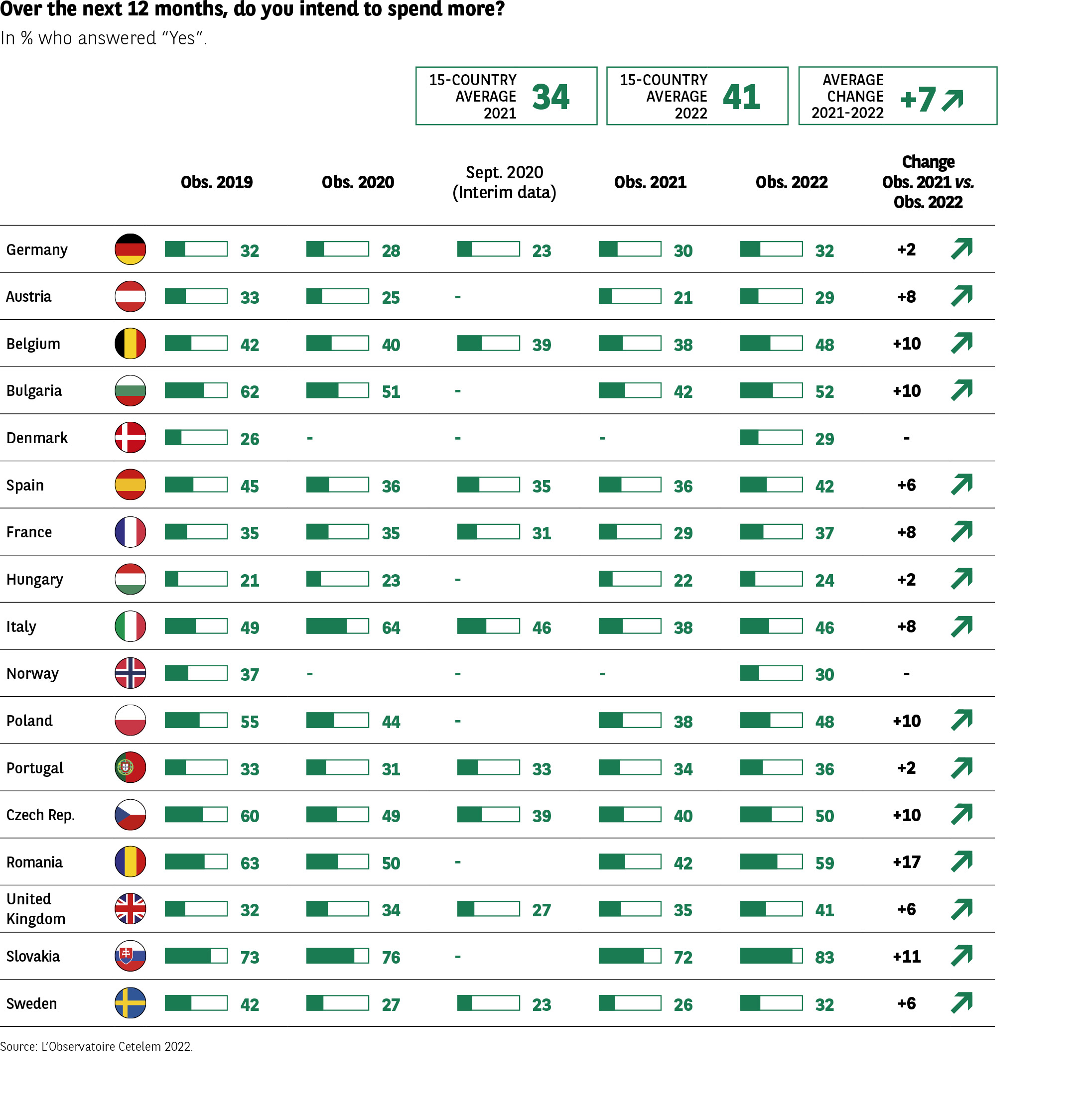 The infographic presents, in percentage, the share of people who answered “Yes” to the question: “In the next 12 months, do you think you will increase your expenses?” The data covers 2019, 2020, an intermediate measure in September 2020, 2021, and 2022, for 17 European countries.
Header: • Average of 15 countries in 2021: 34% • Average of 17 countries in 2022: 41% • Average evolution 2021-2022: +7 points
The arrows are decorative.
Key Visual Elements • List of countries with flags. • Rates of people who want to increase their expenses. • Variation 2021 → 2022.
Transcription of Data
Country 2019 2020 Sept. 2020 2021 2022 Var. 21-22
Germany 32 28 23 30 32 +2
Austria 45 25 – 21 29 +8
Belgium 42 40 39 38 48 +10
Bulgaria 62 51 – 42 52 +10
Denmark 26 – – 29 – –
Spain 45 36 35 36 42 +6
France 35 31 31 29 37 +8
Hungary 21 23 23 22 24 +2
Italy 49 64 46 38 46 +8
Norway 37 – – 30 – –
Poland 55 44 – 38 48 +10
Portugal 33 31 33 34 36 +2
Czech Republic 60 49 39 40 50 +10
Romania 63 50 – 42 59 +17
United Kingdom 32 34 27 35 41 +6
Slovakia 73 76 – 72 83 +11
Sweden 42 27 23 26 32 +6
Main Lesson
In 2022, a majority of countries show a significant increase in the intention to increase expenses. The largest increases concern:
• Romania (+17)
• Slovakia (+11)
• Belgium, Bulgaria, Poland, and the Czech Republic (+10)
No country shows a decrease.
The infographic presents, in percentage, the share of people who answered “Yes” to the question: “In the next 12 months, do you think you will increase your expenses?” The data covers 2019, 2020, an intermediate measure in September 2020, 2021, and 2022, for 17 European countries.
Header: • Average of 15 countries in 2021: 34% • Average of 17 countries in 2022: 41% • Average evolution 2021-2022: +7 points
The arrows are decorative.
Key Visual Elements • List of countries with flags. • Rates of people who want to increase their expenses. • Variation 2021 → 2022.
Transcription of Data
Country 2019 2020 Sept. 2020 2021 2022 Var. 21-22
Germany 32 28 23 30 32 +2
Austria 45 25 – 21 29 +8
Belgium 42 40 39 38 48 +10
Bulgaria 62 51 – 42 52 +10
Denmark 26 – – 29 – –
Spain 45 36 35 36 42 +6
France 35 31 31 29 37 +8
Hungary 21 23 23 22 24 +2
Italy 49 64 46 38 46 +8
Norway 37 – – 30 – –
Poland 55 44 – 38 48 +10
Portugal 33 31 33 34 36 +2
Czech Republic 60 49 39 40 50 +10
Romania 63 50 – 42 59 +17
United Kingdom 32 34 27 35 41 +6
Slovakia 73 76 – 72 83 +11
Sweden 42 27 23 26 32 +6
Main Lesson
In 2022, a majority of countries show a significant increase in the intention to increase expenses. The largest increases concern:
• Romania (+17)
• Slovakia (+11)
• Belgium, Bulgaria, Poland, and the Czech Republic (+10)
No country shows a decrease.
Spending intentions are up
Thus, spending intentions are back up to pre-pandemic levels, with an average of 41% across the countries covered by the survey. In every country, these intentions have either remained stable or increased. In some nations, the rise has been particularly sharp, not least in Eastern Europe, with Romania emerging as the starkest example of the phenomenon (+17 pts). Slovakia also stands apart, with 83% of respondents saying they intend to increase their spending.
Western countries are slightly less enthusiastic in this regard, although the Belgians also appear much more inclined to step up their consumption (+10 pts). Nonetheless, most of the results are lower than those recorded for the 2019 Barometer, a sign that the crisis is still playing on the minds of consumers. Only Belgium and the United Kingdom post pronounced increases since the 2019 survey (+6 and +9 pts).
Fig. 5 Evolution of the savings rate 2000-2020
Download this infographic for your presentations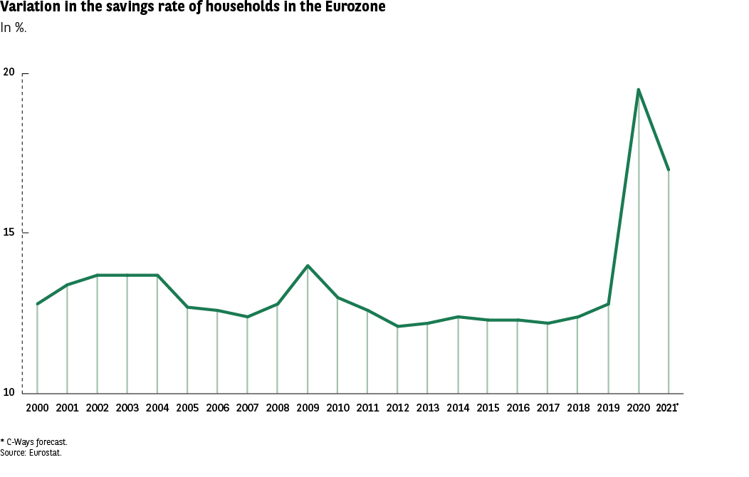 The infographic presents the evolution of the savings rate of households in the euro zone, expressed as a percentage of gross disposable income, from 2000 to 2020.
Source: Eurostat Note: 2020 corresponds to the third quarter.
Key Visual Elements • Linear graph (vertical axis from 10% to 20%). • Horizontal axis covering each year from 2000 to 2020. • A single green curve representing the annual evolution of the savings rate. • The curve is relatively stable for 20 years, with a sharp increase in 2020.
Transcription of Data (approximate, as some values are not explicitly written)
The exact values are not indicated on the curve, but the levels are readable visually:
Year Savings Rate Approx.
2000 ~12.5%
2001 ~13%
2002 ~13.5%
2003 ~13.5%
2004 ~13.5%
2005 ~12.7%
2006 ~12.5%
2007 ~12.3%
2008 ~13.8%
2009 ~14.2%
2010 ~13.2%
2011 ~12.5%
2012 ~12%
2013 ~12.3%
2014 ~12.5%
2015 ~12.2%
2016 ~12.3%
2017 ~12.5%
2018 ~12.8%
2019 ~13%
2020 ~19.5%
(All values are approximate, as the graph does not precisely inscribe them. Mandatory RGAA mention: no data was invented.)
Main Lesson
Over 20 years, the savings rate of households in the euro zone is relatively stable, oscillating around 12-14%. In 2020, an unprecedented jump is observed, reaching nearly 20%, linked to exceptional conditions (not explicitly stated in the infographic).
The infographic presents the evolution of the savings rate of households in the euro zone, expressed as a percentage of gross disposable income, from 2000 to 2020.
Source: Eurostat Note: 2020 corresponds to the third quarter.
Key Visual Elements • Linear graph (vertical axis from 10% to 20%). • Horizontal axis covering each year from 2000 to 2020. • A single green curve representing the annual evolution of the savings rate. • The curve is relatively stable for 20 years, with a sharp increase in 2020.
Transcription of Data (approximate, as some values are not explicitly written)
The exact values are not indicated on the curve, but the levels are readable visually:
Year Savings Rate Approx.
2000 ~12.5%
2001 ~13%
2002 ~13.5%
2003 ~13.5%
2004 ~13.5%
2005 ~12.7%
2006 ~12.5%
2007 ~12.3%
2008 ~13.8%
2009 ~14.2%
2010 ~13.2%
2011 ~12.5%
2012 ~12%
2013 ~12.3%
2014 ~12.5%
2015 ~12.2%
2016 ~12.3%
2017 ~12.5%
2018 ~12.8%
2019 ~13%
2020 ~19.5%
(All values are approximate, as the graph does not precisely inscribe them. Mandatory RGAA mention: no data was invented.)
Main Lesson
Over 20 years, the savings rate of households in the euro zone is relatively stable, oscillating around 12-14%. In 2020, an unprecedented jump is observed, reaching nearly 20%, linked to exceptional conditions (not explicitly stated in the infographic).
The desire to save remains strong
Conversely, intentions to save have remained stable over the last year, although in many cases they are now significantly greater than prior to the health crisis (+15 pts in France between the 2019 and 2022 Barometers) (Fig. 6 Barometer).
54% of Europeans intend to save more. A degree of anxiety and the need to prepare for potential future misfortunes are therefore ever-present in people’s minds, especially at a time when good news follows bad news and vice versa, with there being no guarantee that the former will ultimately prevail over the latter.
Fig. 6 Intention to increase savings in 2019-2022
Download this infographic for your presentations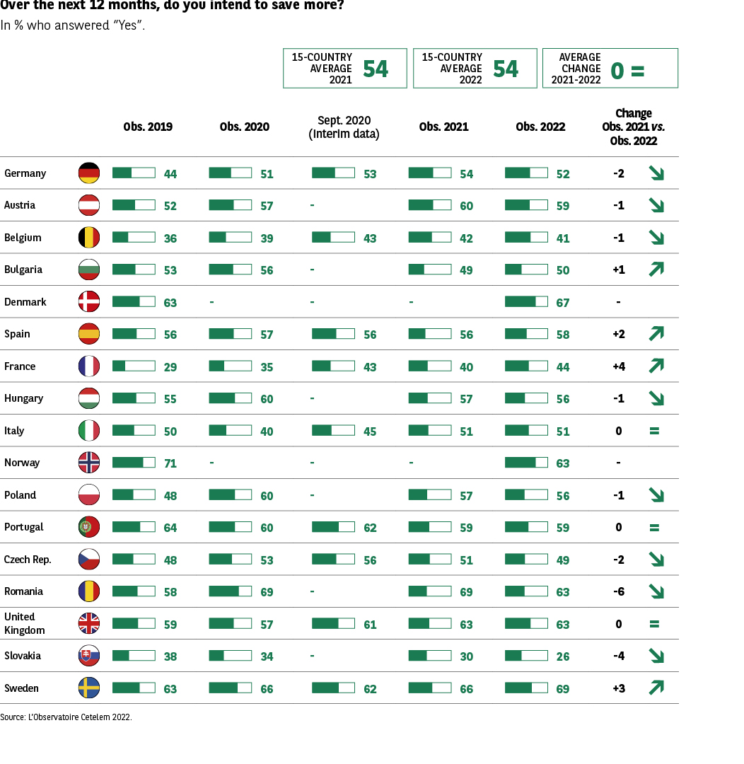 The infographic presents, in percentage, the share of people who answered “Yes” to the question: “In the next 12 months, do you think you will increase your savings?”
The data covers 2019, 2020, an intermediate measure in September 2020, 2021, and 2022, for 17 European countries.
Header: • Average of 15 countries in 2021: 54% • Average of 17 countries in 2022: 54% • Average evolution 2021-2022: 0 (stability)
The arrows are decorative.
Key Visual Elements • List of countries with flags. • Values by year. • Variation 2021 → 2022. • Horizontal bars representing percentages.
Transcription of Data
Country 2019 2020 Sept. 2020 2021 2022 Var. 21-22
Germany 44 51 53 54 52 -2
Austria 52 57 – 60 59 -1
Belgium 36 39 43 42 41 -1
Bulgaria 53 56 – 49 50 +1
Denmark 63 – – 67 – –
Spain 56 57 56 56 58 +2
France 29 35 43 40 44 +4
Hungary 55 60 – 57 56 -1
Italy 50 40 45 51 51 0
Norway 71 – – 63 – –
Poland 48 60 – 57 56 -1
Portugal 64 60 62 59 59 0
Czech Republic 48 53 56 51 49 -2
Romania 58 69 – 62 56 -6
United Kingdom 59 57 61 63 63 0
Slovakia 38 34 – 30 26 -4
Sweden 63 66 62 66 69 +3
Main Lesson
The intention to increase savings remains stable between 2021 and 2022 (54% on average). Most countries record small variations. The main trends are:
Notable increases: • France +4 • Spain +2 • Sweden +3 • Bulgaria +1
Notable decreases: • Romania -6 • Slovakia -4 • Germany and the Czech Republic -2
Several countries remain stable (Italy, Portugal, the United Kingdom).
The infographic presents, in percentage, the share of people who answered “Yes” to the question: “In the next 12 months, do you think you will increase your savings?”
The data covers 2019, 2020, an intermediate measure in September 2020, 2021, and 2022, for 17 European countries.
Header: • Average of 15 countries in 2021: 54% • Average of 17 countries in 2022: 54% • Average evolution 2021-2022: 0 (stability)
The arrows are decorative.
Key Visual Elements • List of countries with flags. • Values by year. • Variation 2021 → 2022. • Horizontal bars representing percentages.
Transcription of Data
Country 2019 2020 Sept. 2020 2021 2022 Var. 21-22
Germany 44 51 53 54 52 -2
Austria 52 57 – 60 59 -1
Belgium 36 39 43 42 41 -1
Bulgaria 53 56 – 49 50 +1
Denmark 63 – – 67 – –
Spain 56 57 56 56 58 +2
France 29 35 43 40 44 +4
Hungary 55 60 – 57 56 -1
Italy 50 40 45 51 51 0
Norway 71 – – 63 – –
Poland 48 60 – 57 56 -1
Portugal 64 60 62 59 59 0
Czech Republic 48 53 56 51 49 -2
Romania 58 69 – 62 56 -6
United Kingdom 59 57 61 63 63 0
Slovakia 38 34 – 30 26 -4
Sweden 63 66 62 66 69 +3
Main Lesson
The intention to increase savings remains stable between 2021 and 2022 (54% on average). Most countries record small variations. The main trends are:
Notable increases: • France +4 • Spain +2 • Sweden +3 • Bulgaria +1
Notable decreases: • Romania -6 • Slovakia -4 • Germany and the Czech Republic -2
Several countries remain stable (Italy, Portugal, the United Kingdom).
This apparent stability masks quite variable intentions from one country to the next. In four countries, France, Sweden, Spain and Bulgaria, respondents intend to save more (+4, +3, +2 and +1 pt, respectively). However, a larger proportion intend to save less, although the falls posted are moderate (the largest drop is -6 pts in Romania).
Spending focused towards the home and beyond
So what do these intentions to spend more tell us? First and foremost, having been stuck within their borders, at best, and confined to their homes, at worst, frustrated Europeans are now determined to get out and about. Purchase intentions centred on travel and leisure have seen the strongest increase (+10 pts), reasserting their position at the top of the list, which had wavered last year. Marked increases in several other categories confirm the desire expressed by Europeans last year to prioritise their home, their comfort and the organisation of their living space, highlighting the pandemic’s impact in prompting people to refocus on themselves and on their family.
Indeed, home improvement / renovation, buying furniture and purchasing household appliances are up +3, +3 and +2 pts, respectively. In contrast, European consumers seem to have acquired all the electronic and leisure equipment they could need during the various lockdowns. Faster broadband, tablets and games consoles are down slightly, but smartphones and streaming subscriptions are up a fraction (Fig. 7 Barometer).
Fig. 7 Purchase intentions by product category
Download this infographic for your presentations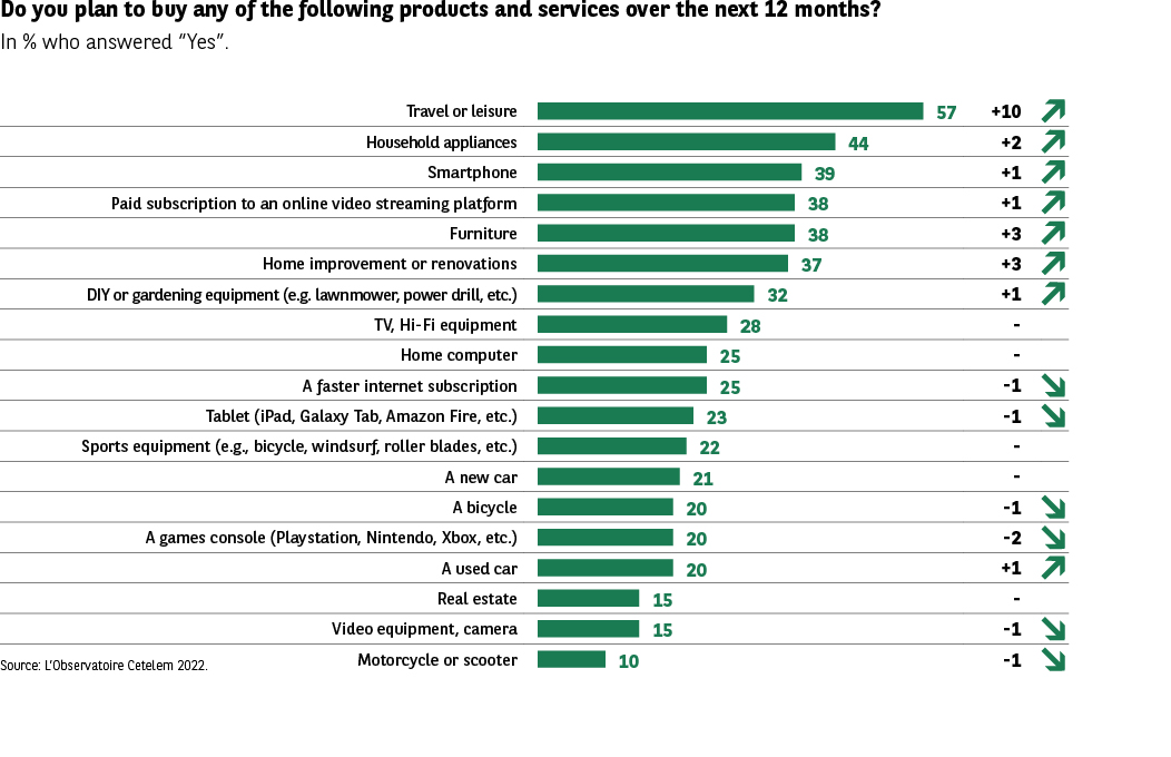 The infographic presents, in percentage, the purchase intentions of different products and services over the next 12 months. It compares the current value to that of the previous year and indicates the evolution in points.
Source: The Cetelem Observatory 2022.
The arrows indicating an increase or decrease are decorative.
Key Visual Elements • A vertical list of product/service categories. • A horizontal green bar representing the percentage of people interested in buying. • A column indicating the evolution in points compared to the previous year. • The products are ranked from most to least considered.
Transcription of Data
Category % of Purchase Intention Evolution
Travel or leisure 57% +10
Household Appliances 44% +2
Smartphone 39% +1
Video streaming subscription 38% +1
Furniture 38% +3
Renovation or DIY work 37% +3
Gardening or DIY equipment 32% +1
TV/Hi-fi equipment 28%
Home computer 25%
Faster internet subscription 25% -1
Tablet (iPad, Galaxy Tab, etc.) 23% -1
Sports equipment (bike, rollers, etc.) 22% –
New car 21%
Bike 20% -1
Game console (PlayStation, Xbox, etc.) 20% -2 Used car 20% -1
Real estate 15%
Video/photo equipment 15%
Motorcycle/scooter 10%
Main Lesson
The strongest purchase intentions are for:
• Travel and leisure (+10 points, first item at 57%)
• Appliances (44%)
• Smartphones and video subscriptions (≈ 38-39%) • Furniture and renovation (significant increases)
The categories in decline or stability concern mainly: • Internet subscription, tablets, consoles, vehicles (new or used)
• Motorcycle/scooter (only product at 10%)
Overall trend: return to pleasure and housing expenses, while technological equipment progresses slightly or stagnates.
The infographic presents, in percentage, the purchase intentions of different products and services over the next 12 months. It compares the current value to that of the previous year and indicates the evolution in points.
Source: The Cetelem Observatory 2022.
The arrows indicating an increase or decrease are decorative.
Key Visual Elements • A vertical list of product/service categories. • A horizontal green bar representing the percentage of people interested in buying. • A column indicating the evolution in points compared to the previous year. • The products are ranked from most to least considered.
Transcription of Data
Category % of Purchase Intention Evolution
Travel or leisure 57% +10
Household Appliances 44% +2
Smartphone 39% +1
Video streaming subscription 38% +1
Furniture 38% +3
Renovation or DIY work 37% +3
Gardening or DIY equipment 32% +1
TV/Hi-fi equipment 28%
Home computer 25%
Faster internet subscription 25% -1
Tablet (iPad, Galaxy Tab, etc.) 23% -1
Sports equipment (bike, rollers, etc.) 22% –
New car 21%
Bike 20% -1
Game console (PlayStation, Xbox, etc.) 20% -2 Used car 20% -1
Real estate 15%
Video/photo equipment 15%
Motorcycle/scooter 10%
Main Lesson
The strongest purchase intentions are for:
• Travel and leisure (+10 points, first item at 57%)
• Appliances (44%)
• Smartphones and video subscriptions (≈ 38-39%) • Furniture and renovation (significant increases)
The categories in decline or stability concern mainly: • Internet subscription, tablets, consoles, vehicles (new or used)
• Motorcycle/scooter (only product at 10%)
Overall trend: return to pleasure and housing expenses, while technological equipment progresses slightly or stagnates.
The desire to spend is being kept under control
Purchase intentions have therefore increased somewhat, but the desire to spend lags far behind, confirming that the time to celebrate and throw caution to the wind is not yet upon us. Compared with the previous Observatoire Cetelem Barometer, this desire has stabilised to some extent (+1 pt), but still fails to reach the level recorded before the health crisis (Fig. 8 and 9 Barometer).
Meanwhile, the previous geographical trend has been reversed, with the desire to spend falling in Eastern European countries, but rising in the West. The Poles post the biggest drop (-7 pts), while Austria, France and the UK are where the largest rises are recorded (+6, +5 and +5 pts, respectively). And although the score posted by the Italians has fallen significantly (-5 pts), their desire to spend more remains the second strongest in the survey, just behind the Bulgarians.
Fig. 8 Perception of expenses in France and Europe
Download this infographic for your presentations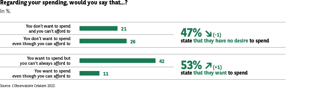 The infographic compares the perception of personal expenses in France and in the rest of Europe.
It presents the share of respondents who declare:
1. “My expenses are too high”
2. “I manage my expenses well”
3. “I could increase my expenses”
These data come from the Cetelem Observatory 2022.
Key Visual Elements • Three groups of bars (France vs Europe). • Color code: • Yellow for France • Green for Europe • The bars indicate proportions in percentage. • The graph does not have a horizontal axis with numbers.
Transcription of Data
Statement France Europe “My expenses are too high” 70% 69% “I manage my expenses well” 56% 53% “I could increase my expenses” 28% 33%
Main Lesson
The French are slightly more numerous than Europeans in managing their expenses (56% vs 53%). A very large majority, in both cases, thinks that their expenses are too high (≈ 70%). Europeans are slightly more numerous than the French in considering that they could increase their expenses (33% vs 28%).
The infographic compares the perception of personal expenses in France and in the rest of Europe.
It presents the share of respondents who declare:
1. “My expenses are too high”
2. “I manage my expenses well”
3. “I could increase my expenses”
These data come from the Cetelem Observatory 2022.
Key Visual Elements • Three groups of bars (France vs Europe). • Color code: • Yellow for France • Green for Europe • The bars indicate proportions in percentage. • The graph does not have a horizontal axis with numbers.
Transcription of Data
Statement France Europe “My expenses are too high” 70% 69% “I manage my expenses well” 56% 53% “I could increase my expenses” 28% 33%
Main Lesson
The French are slightly more numerous than Europeans in managing their expenses (56% vs 53%). A very large majority, in both cases, thinks that their expenses are too high (≈ 70%). Europeans are slightly more numerous than the French in considering that they could increase their expenses (33% vs 28%).
Fig. 9 Evolution of perceived purchasing power over one year
Download this infographic for your presentations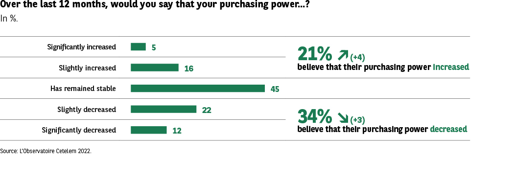 The infographic presents the perception of purchasing power of respondents over the last 12 months, in percentage. It is a distribution of responses in five categories ranging from “significantly increased” to “significantly decreased”.
Two synthetic indicators are displayed on the right: • Share of those who think their purchasing power has increased • Share of those who think it has decreased
Source: Cetelem Observatory 2022. The arrows (increase/decrease) are decorative.
Key Visual Elements • Five horizontal bars representing percentages. • Two synthetic indicators on the right: • 21% say their purchasing power has increased (+4 points) • 34% say it has decreased (-3 points) • Uniform green bars, without differentiated code for categories.
Transcription of Data
Declared Category Percentage
Significantly increased 5%
Rather increased 16%
Remained stable 45%
Rather decreased 22%
Significantly decreased 12%
Synthesis:
• 21% (+4) think their purchasing power has increased
• 34% (-3) think it has decreased
Main Lesson
Almost half of the respondents (45%) think their purchasing power has remained stable. The proportion of people who think they have lost purchasing power (34%) remains higher than those who think they have gained (21%), but the gap is slightly reduced. The evolution thus shows a slight improvement in perception, even if the majority does not notice an increase.
The infographic presents the perception of purchasing power of respondents over the last 12 months, in percentage. It is a distribution of responses in five categories ranging from “significantly increased” to “significantly decreased”.
Two synthetic indicators are displayed on the right: • Share of those who think their purchasing power has increased • Share of those who think it has decreased
Source: Cetelem Observatory 2022. The arrows (increase/decrease) are decorative.
Key Visual Elements • Five horizontal bars representing percentages. • Two synthetic indicators on the right: • 21% say their purchasing power has increased (+4 points) • 34% say it has decreased (-3 points) • Uniform green bars, without differentiated code for categories.
Transcription of Data
Declared Category Percentage
Significantly increased 5%
Rather increased 16%
Remained stable 45%
Rather decreased 22%
Significantly decreased 12%
Synthesis:
• 21% (+4) think their purchasing power has increased
• 34% (-3) think it has decreased
Main Lesson
Almost half of the respondents (45%) think their purchasing power has remained stable. The proportion of people who think they have lost purchasing power (34%) remains higher than those who think they have gained (21%), but the gap is slightly reduced. The evolution thus shows a slight improvement in perception, even if the majority does not notice an increase.